Not all websites are award-winning websites. Every single one is different and unique, some more than others. They range in looks and features, but what makes an award-winning website?
Is it the unique and colorful aesthetics or the simple and ever so popular minimalism? Or maybe the quality images and graphics that increase user engagement?
A few weeks ago, we wrote a blog post on the 9 things that high converting websites have, and they included the following:
- clean navigation paths,
- effective headlines,
- responsiveness,
- visuals that build trust and engagement,
- live chats,
- no unnecessary elements,
- quality images,
- highly visible call-to-action buttons,
- and testimonials and reviews.
Today, we decided to look at 3 award-winning websites and review them in order to get to the bottom of what makes a highly successful site, so you too can get some ideas and maybe even implement their features.
Let’s begin.
1. Zillow – a simple and stunning real estate website
Zillow is a business that deals with selling and buying real estate, which sounds super boring right off the bat. But trust me, their website is anything but boring. This is the reason why it found its place on our list of award-winning websites.
Let’s look at the homepage that greets you when you click their website:

Stunning, isn’t it? The image used for the background is a perfect choice: the shades of blue work perfectly with the yellow tones and it evokes peace.
The decision to decorate with candles and pillows is probably no coincidence: they’re usually associated with comfort and relaxation.
In one of the previous blog posts, we wrote about high contrast and how necessary it is when it comes to web design.
Here, it’s executed really well. The background doesn’t clash with the headline and search box because of the contrast between them.
High contrast is undoubtedly a characteristic of an award-winning website.
Next up: the simplistic design and navigation.
People looking to rent, sell and buy homes have no time for complicated layouts and confusing websites.
Buying a house is already a huge and complicated feat, so the last thing they want to do is spend 15 minutes trying to find their way around a website. Here’s what you see after you scroll down their homepage for a second:
They made it so easy for people to choose what they want to do: the three boxes that let you choose whether you want to buy a home, sell it or rent it can be found on their homepage easily.
The use of white space is great and it really helps highlight the important parts of the website.
Now, let’s talk about the graphics. It’s obvious that all of them are custom made and fit the background photo we mentioned earlier (note the shades of blue and yellow).
The website is simple, stunning, and maybe most importantly, coherent. No element looks nor feels out of place, and the unity of effect that is achieved through the use of colors is something worth noting down.
2. Apple – minimalist and sleek
Apple is famous for its minimalist and sleek products, and when it comes to their website, it doesn’t lack in neither of those qualities.
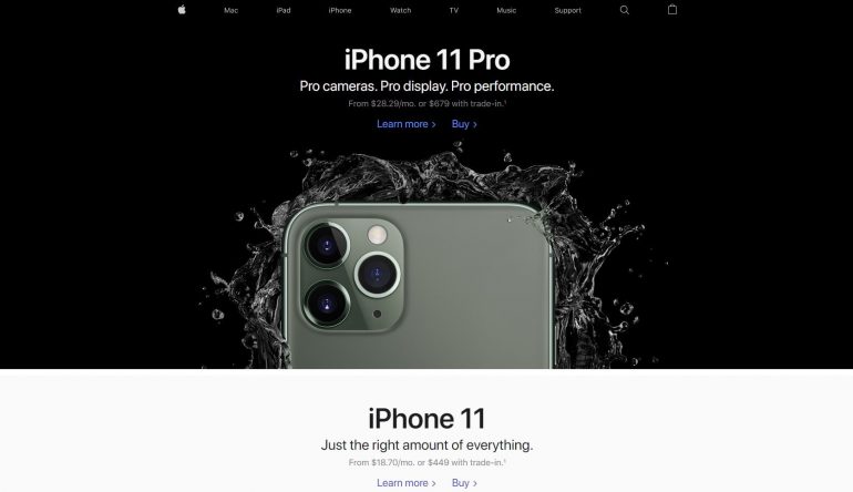
Let’s look at the Apple homepage:
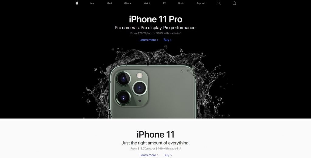
Black and white have always been associated with sophistication, which is exactly the kind of impression their website leaves.
Their newest product, the iPhone 11 Pro, is part of the background and it tells you: ‘hey, check me out, I’m brand new and have amazing new features’.
When you start scrolling down their homepage, you’re in for a surprise:

You’re immediately greeted by a bunch of colors, both striking shades, and pastels. By doing this, Apple is showing off their huge choice of colors in which you can buy their products.
Also, notice how this splash of color isn’t causing an eye strain?
It’s used smartly and on a white background, so white space surrounds the products and helps them stand out. Smart use of white space is another characteristic of an award-winning website.
Alright, the homepage looks minimalist and unique, but what about the rest of the website? Here’s a screenshot of their iPad product page:

More white space and minimalism, which make the product image pop and draw the eye of the visitor to it.
Personally, I love that they used a super colorful image on the iPad because it matches the colorfulness of the homepage.
If you click any product in their store, you will get a page similar to this one:

The page couldn’t be simpler: there’s a single product image and all the rest are specifications that, as you choose, minimize themselves.
When you start scrolling down, you’ll find more images related to the product and then recommended products, in this case, the Apple Pencil and the Smart Keyboard.
When it comes to this award-winning website, I think we can all agree that the simplicity of the Apple website and the fearless use of white space are as effective as they are attractive.
3. Toggl – daring colors and unique graphics
Here’s the last (but not least) of three award-winning websites on the list.
Toggl is a time tracking service and has a website so unique that I spent more than 15 minutes on it. When I show you their website and tell you more about it, you’ll realize why.
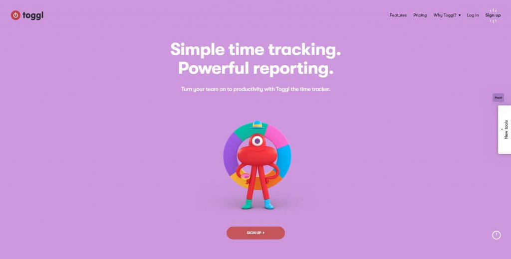
Here’s the homepage:
You can immediately see why it’s so unique: the purple background, the color wheel and the cute red creature (I’ll just call it Toggl, for the sake of this article) are all different colors.
Unlike Apple’s black and white subdued design and Zillow’s use of white space and small graphics, this website goes all out.
Aside from the daring choice of colors, what makes it stand out in a sea of websites are the unique graphics, most of which move when you open a page or click something.
For example, in the image above, the color wheel wasn’t there when I opened the page.
There were a bunch of moving objects around Toggl and they looked like this:
After Toggl tapped its watch, the objects got turned into different parts of the color wheel and formed it.
Moving on, as you scroll down the homepage, you’ll notice even more colors popping up:

You’ll see pink, yellow, green and purple, but they’re not random colors. On the contrary, they’re all colors on the color wheel I mentioned earlier.
Speaking of colors, here’s what their pricing page looks like:
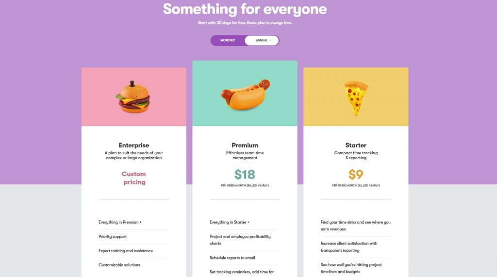
I love how they’re not afraid to use colors even on a page as serious as this. What I found especially charming is the fact that the burger, hot dog and pizza do a little animation as you click ‘monthly’ and ‘annual’.
If you scroll down a bit more, you’ll notice that their call-to-action buttons are red, which makes them stand out from the rest of the page, and even they do a little animation as you hover over them.
Another thing that this website has, but the previous two don’t, are the testimonials near the bottom of the homepage.
They tell the visitor that their experience with the Toogl service was great and that their business can be trusted.
If you have the time, I’d definitely recommend you visit this website and have a look around.
Conclusion
Looking at all three award-winning websites, there are quite a few features that they all have in common and that can be seen as signs of an award-winning website.
They all make good use of white space in order to make other elements stand out and they have simple navigation menus that don’t confuse the visitor. Additionally, they utilize color smartly and create a unity of effect throughout the entirety of the websites.
Aside from Apple, the two other websites have custom graphics that contribute to the overall aesthetics, and in Toggl’s case, the fact they’re animated greatly reduces the bounce rate because people want to stay on the website and see more cute animations.
Hopefully, this gives you some insight into what makes an award-winning website and helps you come up with some features that you can implement into your own site.
Thank you for reading!

