Although the exact number is not known, estimates tell us that there are more than half a million fonts in the world.
With its wide selection of fonts, there are endless possibilities for customizing one’s creative projects.
Whether it be a classic variation or something totally new and unique, the range of font options ensures that every project can have an individualized flair.
That is why it is necessary to know as many different types of fonts as possible and which to use for the best possible results.

Today we are going to present you everything you should know about types of fonts – from the four main types of fonts, different styles, and typeface classification, to many other things that will be very useful to you.
So let’s get started!
Different styles of fonts
Before we start talking about different types, you should know that there is something called the anatomy of fonts.
Fonts are carefully crafted to fit between the baseline and mean line. Anything beyond these two lines is referred to as ascender or descender, adding depth and personality to your text.
Ascender is when part of the lowercase letter goes above the mean line, while descender is when part of the lowercase letter is positioned below the baseline.
These elements are something that every font has in common. What sets the fonts apart are the shape, thickness, height, and much more, which actually classifies the fonts into different groups.
Overall, the most basic distinction between fonts is the difference between serif and sans-serif fonts. Sans serif looks very simple, while serif font looks decorative.
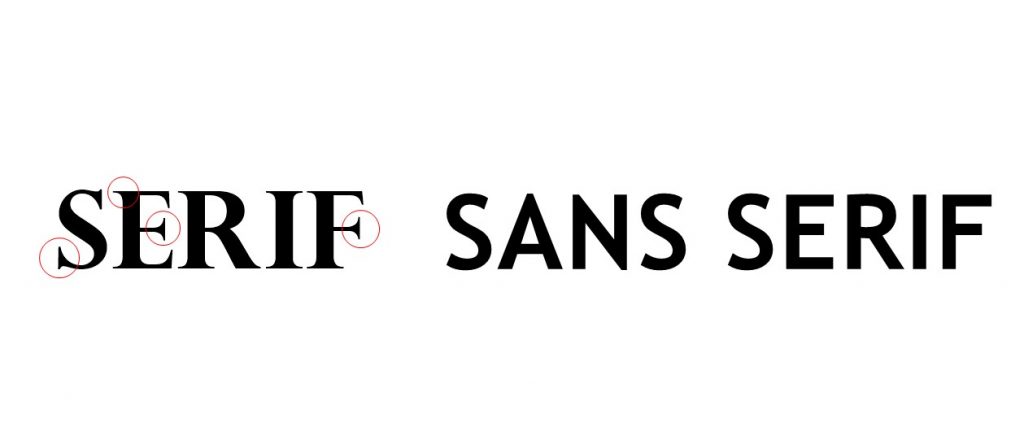
Certain parts of the serif font that look like ornamentals and are called “serifs” do not exist in sans serif, which actually means “without serifs”. That is the crucial difference between them.
There are many subcategories within serif and sans serif fonts and a few more types, which we will discuss below.
What are the four main types of fonts?
There are four main types of fonts that you will encounter often and most fonts are just variations of one of these four types.
In addition to the already mentioned serif and sans serif fonts, the other two types of fonts are script fonts and display fonts.
Let’s learn more about them and mention some of the most famous variations of these 4 main types:
- Serif fonts
- Sans serif fonts
- Script fonts
- Display fonts
1. Serif fonts
The reason for the serif font being first on our list is that it is the oldest font type.
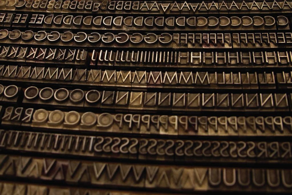
Letters with serifs became the default and were used for centuries, so when Gutenberg devised the movable type printing press, the books were printed in letters with serifs.
Because of their origin, serif fonts are associated with the old and traditional, but this doesn’t mean they’re not used anymore.
There are 4 types of serif fonts that have their own separate uses and variants, so let’s take a look:
- Old-style serif fonts
- Transitional serif fonts
- Didone serif fonts
- Slab serif fonts
Old-style serif fonts
Old-style serif font originated in 1465, shortly after Gutenberg invented the movable type printing press.
These fonts are characterized by a small difference between thick and thin lines, as well as curves that connect the serifs to the strokes.
Other old-time serif fonts include Bembo, Bookerly, Cartier, Callisto, Gentium, Palatino, Requiem, and many others.
Nowadays, they’re rarely used in web design, but they have found their use in printing, book covers, and movie posters.
For example, Penguin Books, Oxford University Press, Cambridge University Press, the National Gallery, and many others use Bembo as their body typeface.

Fun fact: The Requiem font is most often used for credits in movies and TV shows.
Transitional serif fonts
These fonts are also referred to as baroque fonts and became widely used mid-18th century.
They got their name because they present a mix of old-time and more modern fonts. For example, Times New Roman is also one type of transitional font.

The difference between thick and thin lines is more obvious, and many of them have more round serifs (as opposed to strokes) and a more vertical axis.
In addition, they’re still very much used and other transitional fonts include Baskerville, Georgia, Bookman, Cambria, Perpetua, and others.
Didone serif fonts
Didone is a more modern version of the serif fonts and it first appeared in the late 18th century. These fonts were immediately a huge hit and could be found everywhere.
Compared to the previous two serif types, this one is sleeker and looks neater and more trimmed. Here’s an example of a Didone font:

These fonts are characterized by narrow serifs that have a constant width, thick vertical strokes of letters, and a strong contrast between the horizontal and vertical parts of letters.
The Didone fonts are usually associated with fashion, but they can be found everywhere. And out of the four serif types, the Didone fonts are used the most in web design.
Slab serif fonts
The slab serif fonts appeared during the early 19th century. Their purpose was to grab attention, hence their main characteristic: thick and bold serifs.
In the past few years, their use significantly increased, probably because of their bold and clean design.
They used to be everywhere: from magazine and book covers to brand logos and web design. For instance brands such as Honda, Sony and Volvo still use this type of font.
2. Sans serif fonts
As minimalism became more popular, the need for simpler and cleaner fonts appeared. So, due to that, Sans serif fonts entered the scene.
These fonts, as previously mentioned, don’t have serifs and look more modern and sleeker.
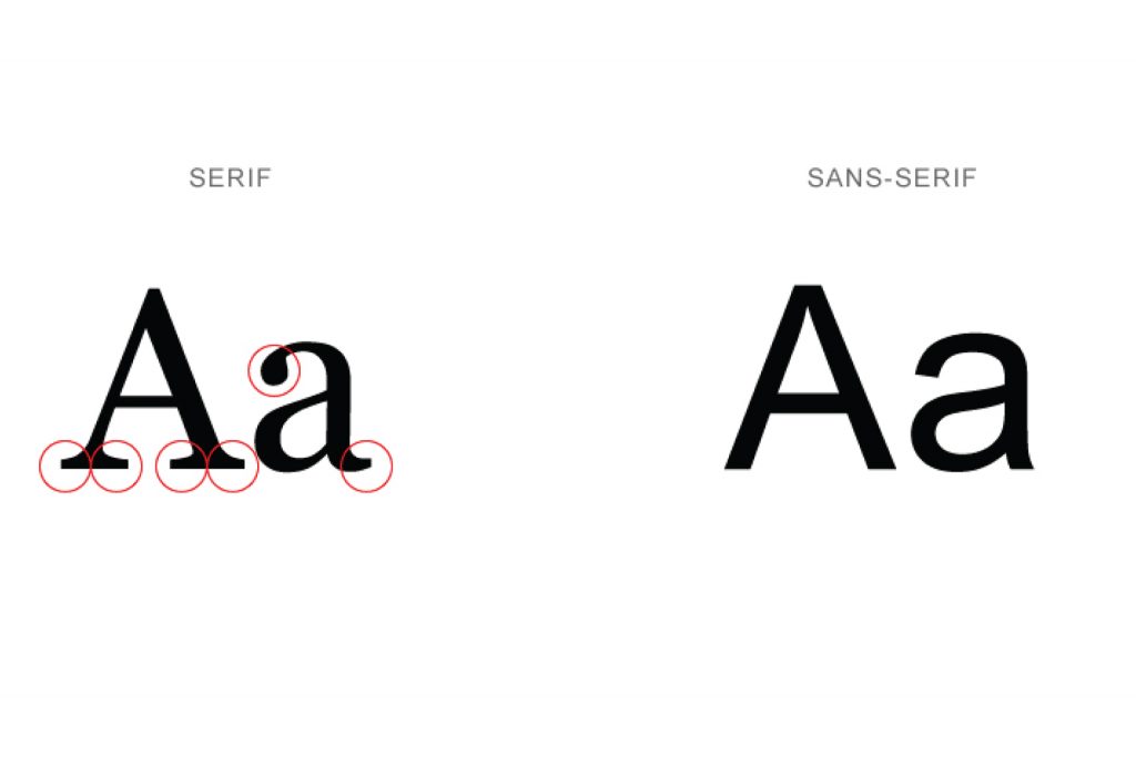
Just like the serif fonts, sans serifs also have variations, depending on the period when they were made and their appearance.
Their sleek appearance works perfectly paired up with modern web design, and when it comes to web articles, their lack of serifs enables cleaner-looking text and increased readability.
Let’s look at the sans serif font variations, of which there are 4 types.
- Grotesque sans serif fonts
- Neo-grotesque sans serif fonts
- Geometric sans serif fonts
- Humanist sans serif fonts
Grotesque sans serif fonts
The characteristics of these fonts include small contrast and even line widths.
Really interesting thing is that some letters clearly stand out from others, such as the capital R, which is the case with many grotesque fonts.
Irregular proportions are widespread when it comes to grotesque fonts, as well.
Additionally, when grotesque sans serif fonts first appeared, many of them didn’t have bold and italic variations, which limited their use, hence why the body text in newspapers was often in serif fonts.
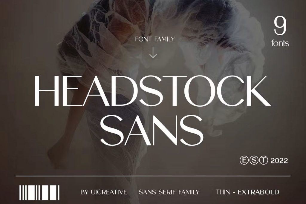
Today, people are still creating grotesque fonts and some of them look pretty amazing and unique, like this one for example:
Neo-grotesque sans serif fonts
As the name suggests, these sans serif fonts present a more modern variation of grotesque fonts. The difference between them is that the neo-grotesque variant looks plainer.
It is really fascinating that it is still very much used today. For example, look at this stunning website that utilizes it as its main font:

Other neo-grotesque fonts include the famous Arial, Android’s Roboto, Impact, as well as Microsoft Sans Serif, and many others.
Geometric sans serif fonts
Geometric sans serif fonts have a geometric appearance, which means squares and nearly perfect circles.
What made these types of fonts popular was the fact they looked even cleaner and even more modern than the neo-grotesque kinds.
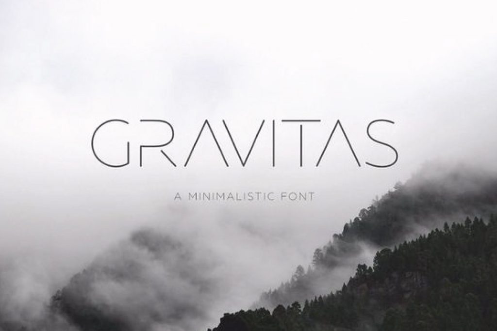
When it comes to these fonts, the letter ‘o’ is almost a perfect circle and the capital letters have different widths. Additionally, the ‘M’ is often spread out.
Other geometric fonts include the famous and ever-so-popular Gotham, Brandon Grotesque, Century Gothic, Nobel, and Metro.
Humanist sans serif fonts
Contrary to the geometric appearance of the aforementioned fonts, humanist sans serif fonts look more like they were drawn by hand and have a more organic appearance, hence their name.

The contrast between the thick and thin strokes is low, the ‘e’ has a slanted crossbar, and the ‘a’ and ‘g’ are double stories, with the aim of readability increase.
They used it in the text under the title, which is in Jubilat, a slab serif font. The body in Freight Sans has a natural appearance and contrasts with the chunky title.
It also gives a friendlier and lighter note to the very serious-looking website.
That was it about serif and sans serif fonts and their variants. But there are more types of fonts in web design, and those are script fonts and display fonts.
Keep reading to find out.
3. Script fonts
As their name suggests, these fonts aim to resemble handwriting.
Because of the fact they are highly ornate, they have very limited use in web design. You won’t see them used for body text.
They have found their use in really short phrases, most often titles.
In addition, script fonts don’t have much in common aside from the fact they look very elegant. The brush strokes vary from font to font, as well as the widths and the way the letters are drawn.
You’ll find them on:
- logos of sophisticated restaurants,
- elegant liquor bottles,
- beauty brand logos and packages,
- posters, etc.
Here are some popular script fonts:

Even if you think that some of these look good they don’t, avoid using any script font that comes with your computer.
The wrong use of a script font can ruin an entire website and make people think that an amateur made it.
If you really want to use a script font, find them on the internet instead. You will have to pay for the best ones, but you can find nice-looking ones that are free if you spend some time searching.
4. Display fonts
Here are the last types of fonts in web design on our list. Display fonts, also known as decorative fonts, are the most diverse group of fonts.
The fonts that belong in the decorative group vary in appearance so much that they often look like they don’t share a group.
Here are examples of some of them:
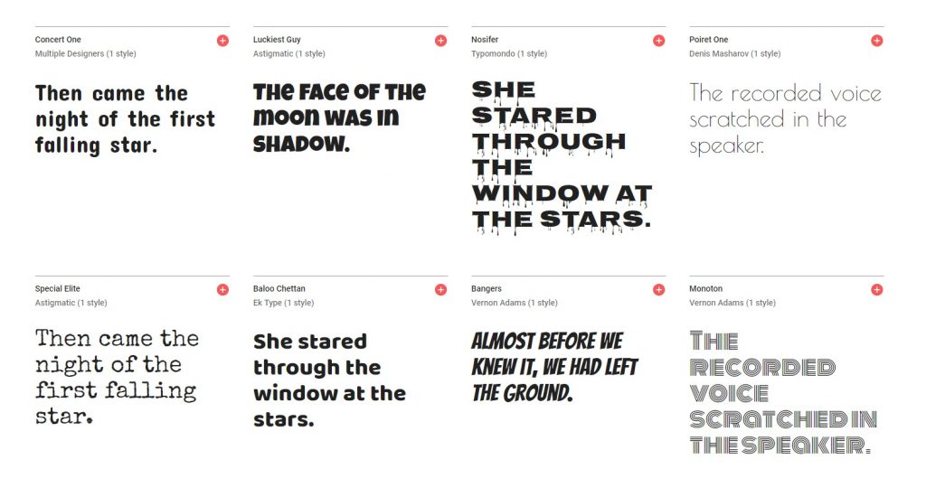
As you can see, their appearance varies: there are highly decorative ones (Monoton), there are minimalist ones (Poiret One), Bangers looks very comic, and Special Elite is a typewriter font.
They all look like they have nothing in common, except the fact they are used for titles and not body copy.
In addition, there are different styles of display fonts, and they include:
- script looking fonts
- fonts with shadows and engravings
- fonts where upper and lower case letters are mixed
- distorted fonts
- very light or very bold fonts
- fonts with reverse contrasts
- alphabet redesigns
How do I identify a font?
Due to the huge number of fonts that exist, it is not possible to recognize most fonts, except for a few of the most common ones we mentioned.
But since even these most common types have a lot of subcategories, it will often happen that you see a font somewhere that you like and think you should implement it, but you can’t identify it.
Fortunately, there are several tools that can do this for you, such as:
In case you fail to find it after using all of those tools, your last resort will be to contact someone who is a font expert or upload an image to the forums where someone will probably solve your dilemma.
Best fonts for websites and how to choose one
When you are looking for the best types of fonts for your website, the first thing you must consider is whether the font you like falls into the category of web-safe fonts.
Web-safe fonts are those fonts that will suit different browsers as well as different devices like smartphones, tablets, and so on.
But that’s not all. Web-safe fonts, as well as those that are not, significantly affect SEO.

If you use web-safe fonts loading speed will be significantly higher than when you use those fonts that are stored locally and are not installed everywhere and then visitors to your site will experience slow loading.
This is disastrous both for SEO and for the general impression that users will have about you.
So before you opt for a particular font or more of them, first make sure that they are web-safe fonts, and only then proceed to the design of your website.
How to choose a font for the website?
There are a few factors to consider when choosing suitable fonts for your website assuming that you are going to choose some of the web-safe fonts, and that is:
- type of brand,
- number of fonts,
- language, and
- amount of content.
Type of your brand
Font should be chosen based on the characteristics of your brand.
Each brand, both because of its characteristics and the niche it belongs to, has some visual characteristics. For example, the beauty brand compared to the IT-related brand is completely different.
So first you need to think and research what fonts are mostly used by brands like yous. You certainly shouldn’t plagiarize them, but you should get some impression.
Decide on the number of fonts you are going to use
The golden rule is that you should not have more than 3 different fonts on your website. In some cases, you can use more than 3 fonts, but it is best to stick to having 2 to 3.

First, choose the primary font that will be most visible and you will use it for your brand name and other large text such as titles.
The secondary font is also important because it is actually the most represented on your website. You will use it for all the text and therefore it must be easy to read.
You can also implement a third font, but only in a few places like call-to-action, menus, and the like. It can look embellished to attract attention, but it mustn’t dominate.
Language
Your goal is probably to get people from all over the world to visit your website.
Many know English and will browse your website in its original form, but many will also take advantage of the translation options and switch to their language.
This can be a problem if your font only has Latin letters and then when translated, the website will completely lose its look.
It is impossible to find a font that supports all the languages of the world, but make sure it has at least some characters from other languages.
Think about which market your brand is most interesting for, and choose a font that is adapted to specific foreign languages.
Amount of written content
The amount of text found on your website also dictates the choice of all the fonts you use.
If there is very little written content, you have more choice than if you focus on a blog and the like. In case your blog and generally written content is your primary thing, you need to choose a font that is easy to read.
The point of a blog is for people to learn something new, not to attract attention with colorful design and ornate fonts.
So if you have a lot of content, our recommendation is to choose one of the sans-serif fonts.
Where can you find web fonts?
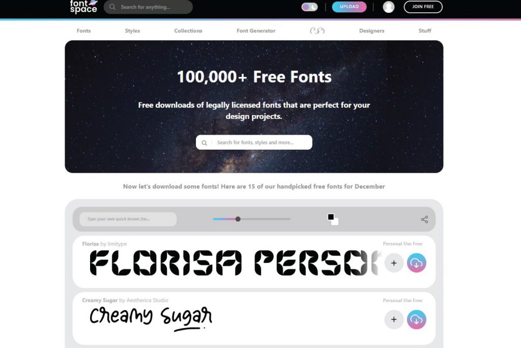
There are many websites where you can download different fonts, try them out, and implement them.
Don’t always choose default fonts, because that doesn’t seem creative at all. Investigate what’s available to you, make sure it’s a web-safe font, and then fit that into your brand identity.
Google Fonts is probably the most popular site for finding fonts, as its name suggests.
All the fonts you can find there are open-source, which gives you a lot of freedom to use them however you want.
Alongside Google fonts, there are many more reliable sites like Font Squirrel where tens of thousands of different fonts are available, so take some time to find the right one.
Font quiz
Do you think you’ve mastered the four main types of fonts and their subcategories?
To check your knowledge, head over to our portfolio page and try to identify the fonts of 3-4 of our projects.
After you’re done and want to know if you’re correct about the types of fonts, you can contact us and we will respond to you shortly.
Thank you for reading! We can’t wait to see your answers.


