There are no limits to creativity, but there are rules to design.
We can take a single look at a design and immediately decide if it looks good or not. But most often, we cannot exactly explain why it looks good to us, and this is because we are not familiar with the rules of design.
So today, we’re bringing you the 5 core basics or principles of graphic design. After reading the article, you’ll be able to create your own professional-looking graphics and be able to tell why other designs look good to you.
Let’s dive in.
- The principle of contrast
- Contrast of size
- Contrast of width
- Contrast of light
- Contrast of color
- Juxtaposition
- Repetition
- Alignment
- Proximity
- White space
1. The principle of contrast
When it comes to photography, by increasing the contrast, photographers make textures and colors in photos pop.
Think of beautiful photos of old people and intense sunset photographs, they always have the textures turned up and the colors look livelier than usual.
However, in graphic design, contrast is a fully different term. It is not a quality of photos, instead, it presents the obvious difference between elements, allowing some to stand out. It is used to create balance, hierarchy and highlighting of certain elements.
Note how I previously mentioned that contrast is an ‘obvious difference between elements’. The phrase ‘obviously different’ is crucial when it comes to using contrast correctly. Let’s look at an example:
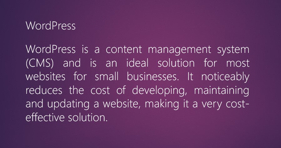
I took this text from the service page of our website. Here, the title of the paragraph is the same size as the rest of the text.
It looks no different from it, in fact, it looks like the first sentence of the paragraph. Its role is not clear, and while scrolling this article, people wouldn’t even notice the paragraph title.
This would create confusion within the reader and affect their reading experience negatively.
Let’s see what would happen if I slightly increased the size of the title:
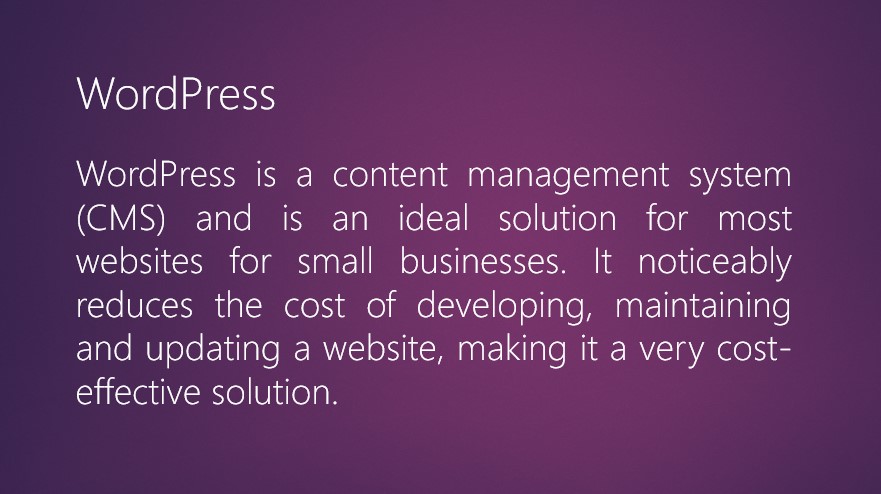
Okay, so I increased the size, so that should be enough, right? It’s really not though; the title still isn’t coming to focus because the size of the title here is only 30 pixels, while the size of the text is 24 pixels. It looks more than a mistake someone made while typing than something they did on purpose.
Now, if I doubled (remember, obvious difference) the size of the title compared to the text, it would look like this:
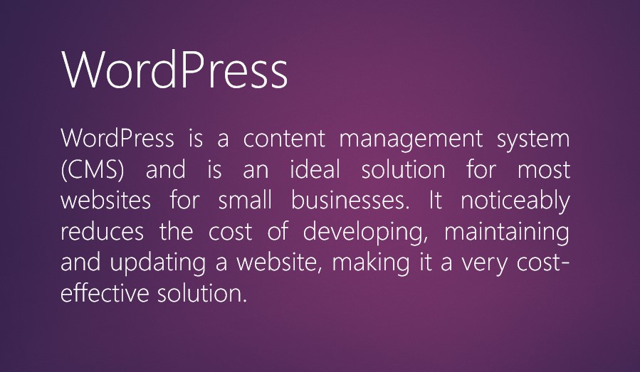
See how much better that is?
It is clear what the title is and what isn’t. When scrolling down and seeing this part of a page, you would immediately read the title first (because it’s bigger) and then the text.
Now that the main thing about contrast is out of the way, let’s look at the different types of it:
- Contrast of size
- Contrast of width
- Contrast of light
- Contrast of color
- Juxtaposition
• The contrast of size
The previous example is a great example of the contrast of size.
The main rule when it comes to this type of contrast is that the title should be evidently bigger than the rest of the text, and using a title that is double the size of the text is absolutely acceptable.
In fact, it is welcomed and looks great. Let’s look at another good example:

The size of the main text is 45 pixels, while the size of the text below it is 22 pixels.
That is more than double, but it works. The purpose of the text is to make ‘W3 Lab Services’ come into focus because when people browse the internet, they don’t read most of the content of a page.
So, when someone is scrolling, they will read the main text and immediately skip to the service list, not even reading the text.
Usually, small text like that has the sole purpose of drawing attention to the bigger text and conveys no important information.
Next up on the list is the contrast of width, so let’s look at what it entails.
• Contrast of width
The same rule of ‘obvious difference’ that goes for the contrast of size also goes for the contrast of width.
You don’t want the title font to be kind of bold, instead, you want to make it twice as bold as the text.
Let’s look at an example:

Here, the contrast of size is properly utilized, but the contrast of width isn’t.
The title font is only slightly wider than the text font, and while the size certainly helps the reader differentiate between the title and the text, it can be improved.
Here’s a better version:

The much wider font draws so much more attention to the title and tells the reader: ‘hey, read this first, it’s important that you do’.
I also made a ‘cost-effective solution’ bold, which is the most important part of the text, as it is something that is highly important to the reader.
• Contrast of light
As the names suggest, the contrast of light is all about the difference between the dark and light. Simple enough, right?
Let’s get to the examples:

Imagine visiting the old SquareSpace website and trying to read this. It would put such a strain on your eyes, you wouldn’t be able to finish reading.
Was this done on purpose so you would sooner click the call-to-action button in the upper left?
Maybe, but it is highly unprofessional and a sign of bad design.
The contrast of light is all about the right contrast between the elements, most importantly the background and the font. There’s even a website dedicated to fighting against low contrast in web design, which I found very amusing.
Here’s an example of a website that did the contrast of light correctly:
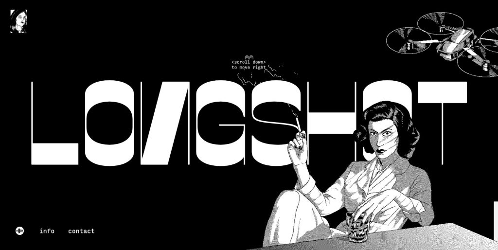
Using black and white for the background and text is a foolproof strategy, but it’s effective and in this case, it looks really good and unique.
If you click through the rest of the website, the background and text will swap colors, but the contrast will always stay high.
The trend in web and graphic design in the past few years has been using photos as backgrounds and placing text on them, which, again, is achieved through the correct use of the contrast of light.
• Contrast of color
The contrast of color is especially important because colors convey emotions and meaning.
Choosing a bad color palette or combining colors that have a bad contrast can cause people to, well, really hate looking at your website and never visit it again.
Think of a stark red background with neon green text, this is a classic example of bad color contrast, as it is two stark colors fighting for dominance.
Also, the SquareSpace example from earlier can be used here, as well.
White backgrounds with grey text have poor readability, which also tells us that the background and text shouldn’t be a similar hue.

Here are some good and bad color contrast examples.
Notice how all the good examples have the text and background in extremely different colors and the contrast between them is high, and all the bad examples have lower contrasts between the colors.
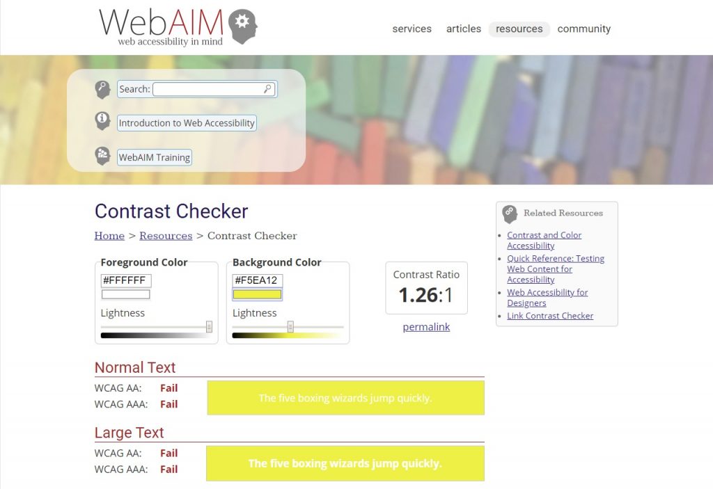
There are free tools on the internet that can help you determine whether the contrast between the colors of your choice is good or bad.
Here’s one of them:
Moving onto the last type of contrast, which is juxtaposition.
• Juxtaposition
The Merriam-Webster dictionary defines juxtaposition as ‘the act or an instance of placing two or more things side by side often to compare or contrast or to create an interesting effect’, which is exactly what it is in graphic design, as well.
Graphic designers utilize a variety of styles and concepts that on first thought wouldn’t go well together to create unexpected designs that are unique, have impact, leave impressions, and attract attention.
So, juxtaposition is a way of fighting the monotone, boring and expected in design.
Let’s look at some examples:

They could have easily gone for a conventional minimalist design, but instead, they utilized a ton of juxtaposition to create a memorable website: the modern font and background versus the old-timey photographs, the pink and cyan animations on the sepia photos, and 3d effects on the motionless photos.
These contrasts worked together to create a website that has won awards.

Here’s another example of the juxtaposition of the old and the modern.
The bust is surrounded by a modern gradient and is wearing sunglasses.
As you scroll down this website, you’ll notice changes and how parts of the page have completely different appearances.

This is another case of juxtaposition, and its purpose is to make the website seem more interesting and less boring.
Notice how the purple part is surrounded by two white ones?
That’s because designers utilize the technique of putting an interesting part after a boring one, so it would attract your attention and convince you to keep scrolling.
That was it about contrast, the first graphic design principle on our list. Next up: repetition.
2. Repetition
This is the second graphic design principle which is all about the use of repetitions of styles, widths, and spaces for one important purpose: consistency.
Without consistency, there is chaos, and chaos leads to people not being able to understand your designs.
Let’s take a look at two examples of websites:
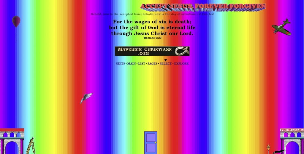
The background moves, so be prepared for an explosion of colors if you click it.
This might be an extreme example, but I wanted two colorful websites that we could compare. This one is obviously a bad example, but why?
After reading the paragraphs about the rules of contrast, you can most probably explain it yourself. The background and text are moving, there is no hierarchy, the sizes of the texts are all over the place, the fonts and Microsoft Word effects on them are tacky, the colors of the rainbow are too stark.
TLDR; there’s too much of everything and there’s no consistency whatsoever. It’s so confusing you don’t even know where to click first.
Let’s take a look at a website that is a great example of consistency and utilizing colors the right way:

The second you open this page, you notice the adorable graphics that are all drawn in the same style. The space of the services is the same width, the text has the same style, the colors are used in the same way, the call-to-action buttons are all the same shade of red.
Notice the overuse of the word ‘same’? That’s because of the consistency of this website. It shows professionalism and that a lot of work and thought went into creating something so unified.
Icon packs present a great example of this graphic design principle:

Notice how all of them are drawn in the same style and use the same color scheme. Using these on a hairdressing website would tie everything together and achieve unity.
3. Alignment
This is the third graphic design principle on our list, and, as the name suggests, it is all about the alignment of elements. Just like repetition, alignment eliminates disorder and creates balance.

The left side looks amateurish and like a bunch of mistakes, and the viewer might spend quite some time trying to figure out what is happening. The right side, on the other hand, gives the viewer an immediately clear message of what is going on. The alignment of the squares makes sense and creates balance among them.
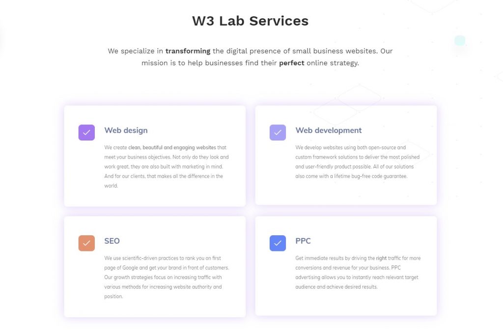
Everything in this example is aligned: the large text on top of the image and the smaller text underneath it are placed in the middle of the page, and the rectangles and the titles of the paragraphs are perfectly aligned, creating a feeling of balance and order.
Let’s move on to the next graphic principle on our list, which is proximity.
4. Proximity
When people are standing close together, we might immediately think they’re a group. This is because of their proximity and the fact that our brains actively try to find wholes in order to make sense of what we see.
In graphic design, the principle of proximity is used to denote that the elements that are close together have something in common, for example, they convey the same kind of information.

I used the same image for this principle, because it’s a perfect example.
The rectangles are placed like this for a reason: they all contain information about certain types of services and the goal of all of them is to let the reader know what they’re about.
Imagine if two of the services were above the ‘W3 Lab Services’ text and two were below it. It just wouldn’t make any sense and their connection would be lost.
Let’s move onto the last graphic design principle, white space.
5. White space
White space, also known as negative space, is the empty space around elements. Its purpose is to make text, images, and buttons stand out. A great example of good use of white space is the Google homepage:

The second you open the page, your eye is immediately drawn to the logo and the search box, which are the most important parts of the page.
The options on the top and bottom don’t distract the visitor and the white space guides your eye where it should be.
If you think that white space isn’t an important graphic design principle, look at the following example:

The page is overwhelming: the different sizes and colors of the text and the images that look like someone scattered them around seem chaotic.
The visitor simply doesn’t know where to look and their attention is all over the place.
This is their new website, which utilizes the principle of white space and looks indefinitely better:

Wrapping up
That wraps up our last graphic design principle.
Now you know the 5 core principles of graphic design:
- contrast and its 5 types (size, width, light, color, and juxtaposition),
- repetition,
- alignment,
- proximity,
- and last but not least, white space.
These core principles work together to create the most stunning designs that are consistent, have the effect of unity and make the important elements stand out.
Hopefully, after reading this article, you’ll be able to explain why you find some designs ugly and others pretty.
If you want to hire professionals to build a website from scratch for you, or your company, contact us!
Thank you for reading!


