Ooops! Page not found!
You have surely been in a situation where the page that you want can’t be found. This error page is called 404.
The visitors are not supposed to end up here. But it is happening when these pages indicate a broken URL when a server is down, or the content is missing.

In this situation, mostly negative experience occurs, but it doesn’t have to be that way.
So, today we are going to present best practices and examples to make 404 pages more user-friendly, and what 404 pages are exactly.
Let’s start.
What is a 404 Page?
The 404 page is also known as the “error page” or “Page Not Found”.
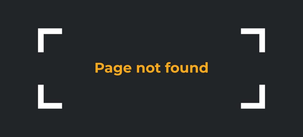
The error page appears when the server can’t find anything on the requested location.
Visitors can click on links that don’t exist anymore, which are deleted or removed, and then they will see a 404 error page.
When everything is alright with your page, the server sends 200 OK status code, but when there are some of the mentioned situations, then a 404 status code will be sent.
The problem occurs when a server provides a 200 status code, but the content user wants to see doesn’t exist.
That information makes search engine bots, as well as Googlebot, and you must fix it as soon as possible.
The 404 error is now a landing page where you can encourage users to continue using your website.
If you have a poor 404 page, this page can be the end of the visitor’s journey.
So, your 404 page design should keep users from leaving.
What should a 404 page include?
Now, when you realize what a 404 page is, it is time to find out what every 404 error page should include being good enough.
Show your users the right way back to the relevant content they were looking for!
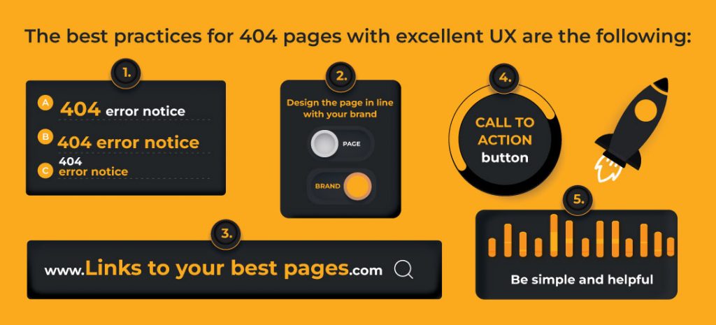
The best practices for 404 pages with excellent UX are the following:
- 404 error notice
- Design the page in line with your brand
- Links to your best pages
- Call to action button
- Be simple and helpful
404 error notice
Let users know they’ve landed on the error page. You will do this by writing a sentence that can be informative, but sometimes humorous, such as:
- Ooops! The page is not found.
- 404 Error. The page can’t be found.
- We are sorry, we can’t find the page that you are looking for.
- You didn’t break the internet, but we can’t find this page.
- We lost this page.
Design the page in line with your brand
It is important that your error page doesn’t look like a mistake, and that your users can find the way they’re looking for.
You can show in a funny way that the page wasn’t found, with a design that suits your company.
Show your logo or special features, so users will recognize your brand and be sure that they are on a secure site.

After concluding that the page they were looking for does not exist, you can direct them to another page you want.
Links to your best pages
Links can help you keep visitors on your site and help them continue their journey.
This is a great job for the best user experience (UX) because when the page that they looking for isn’t found, you offer them other possibilities.
On your 404 page, you should include a few useful links, like a link to your home page, your most popular blog, your most popular or valuable product/category pages, whitepaper downloads, demo sign-ups, etc.

In addition, you should try to avoid losing traffic, even from an error page.
Call to action button
Besides links, textual, and visual elements, there should be a button visible on your 404 page that calls visitors to action.
Add a search bar on the error page, a way for users to report a broken link, a contact page, a contact form, and a download or signup button, and help your potential clients to find the way they want.
Be simple and helpful
If a 404 page is complicated or confusing, then it won’t be helpful for visitors. They will end their search on your site there and go to the next page.
With that, you lost a potential user, who instantly felt unsafe on your site.
In addition, your 404 page shouldn’t be crawled or indexed by Google, so there’s no need to have too many words on this page.
Be simple and helpful, and with good design, links and buttons indicate what users can do to get back on track.
Top 10 examples for 404 page
Each company that takes care of user experience (UX), recognizes that its main focus is solving users’ biggest problems.
That is why the 404 error page has become such an important part of every website.
So, let’s take a look at our list of the top 10 examples for the 404 page.
1. E-Bay
E-Bay’s 404 error page features a simple design and creative caption. Besides, there are guidelines and buttons that help visitors easily find what they are looking for.
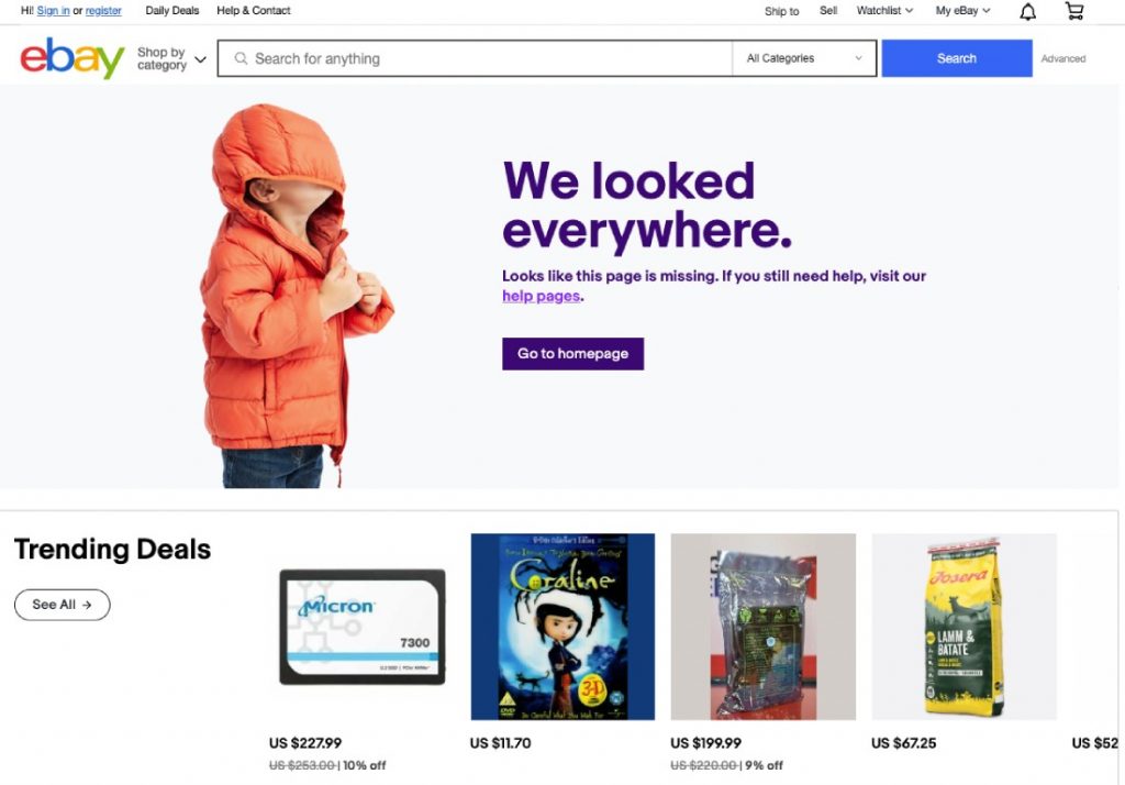
On the page is a clear message and links back to their homepage, help pages, and trending deals with an interesting picture.
2. LinkedIn
Sometimes, simplicity is the key.

LinkedIn “Page Not Found” is the right example of how to easily direct users to wind their way. There is a clear message, link, and button for going back to the feed.
3. Lego
This is the best example of a good design for an error page.

Lego company posted a picture of a famous toy with a dramatic face, which is very interesting for visitors.
Besides, there is an error notification and a call to action button.
4. Blue Path
This is a 404 page in a very creative way.
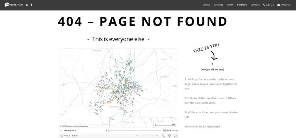
Bleue Path has a great error page with humor and simple graphics. There is a map showing that the user has strayed outside of it.
5. MailChimp
MailChimp created a likable error page with humorous illustrations and informative captions.

There is also a button for the back to the homepage, and the design of the page is in line with the concept of the company.
6. HBO
Another excellent idea for the design of a 404 page is HBO.
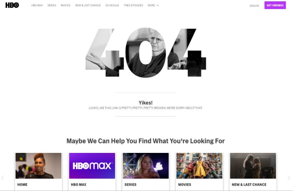
Besides, a creative sorry message, their “Page not Found” is inspired by their offer, with call-to-action buttons.
7. Amazon
A 404 error page on Amazon is unusual and innovative.

They use this page to give you some insight into their company culture with pictures of cute puppies. Every time you get lost, another puppy appears on page 404.
Of course, there is also a sorry message where Amazon takes responsibility for the error, even if it is not their fault.
8. Spotify
The amazing design of their error page is a direct reflection of their brand and their target market, making for the best user experience (UX).

There is also everything else that every 404 page should have, such as a link, button, and simple message.
9. Michelin
The distinctive design of the Michelin logo is the best thing on this error page.
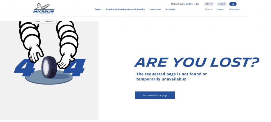
This page gives you the impression that they are here to help you find what you are looking for.
10. Ikea
The creative design of cutlery arranged in number 404 will cheer up any stray user.
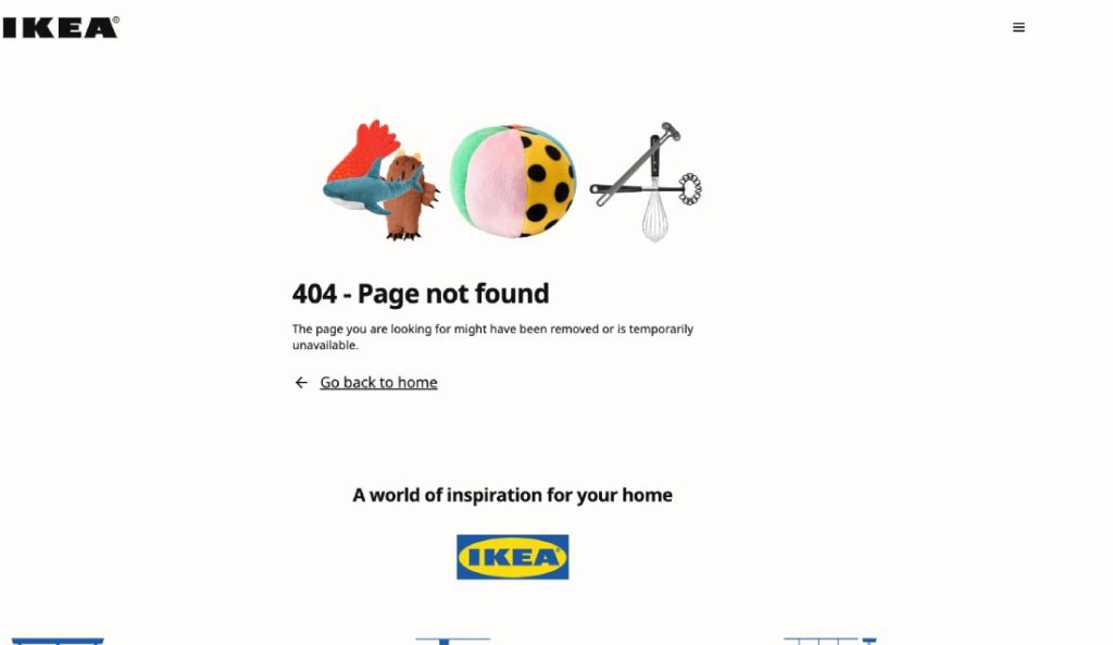
Ikea’s 404 error page includes notification and a simple message with a “go back home” link.
A recognizable logo and slogan will give a customer the feeling that is on a secure site.
Conclusion
We presented to you everything you need to know about the 404 error page.
We hope that our list of top 10 examples for the 404 page will help you get inspiration and awaken creativity.
If you want to achieve the best UX, follow the tips that we listed in this article.
Be unique and creative, and create the best 404 error page ever!


