Do you know that all research about selling online came to one conclusion – effective landing pages are the most successful type of pages for selling online.
So, we have to ask first, what exactly are landing pages?
The landing page is a long scroll page that represents only one product or service. A lot of people got stuck right there – ONLY one product on the whole page?!
Well, it’s better to show for example.
What is the most valuable company in the world? The answer is obviously Apple. And do you know how Apple sells its products online? With landing pages.
Take a moment and think about that. The most valuable company in the world sells its products through landing pages. Are you ready to learn how to make landing pages very easily? Follow these steps.
Take a look at these landing pages of Apple products: iPhone, iMac, iPad. They are great examples of good landing pages. We all know that these three products have more and more competitors every day, but what keeps them best selling in their branch with such high prices?
And what they all have in common?
– They all have effective landing pages!

What do you need for an effective landing page?
The landing page has only one product or service, a bit of text, a solid and simple background, and big attention-attracting images. By looking at a landing page, your desire of owning that product/service increases with scrolling. And what is at the bottom of the page? A Call to Action button, to actually make a purchase!
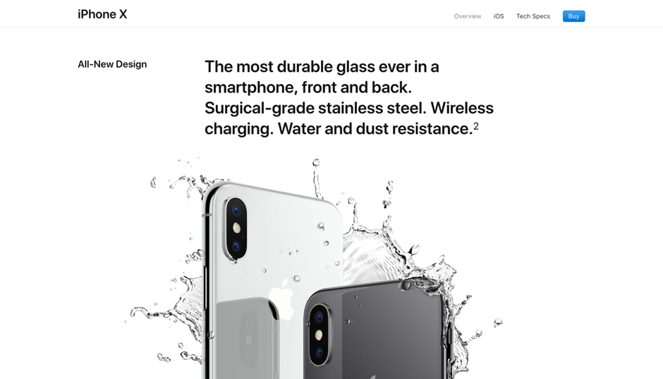
Let’s see the landing page of the iPhone X, and how Apple present their product.

Example of an iPhone landing page: simplistic design, little text, and good-looking images.
You see what we all notice?
Because of the simplicity of illustrations, especially picked-up key features, clean and high-quality images, and often very smooth animations, the landing page is the best of the best.
Attention Ratio – a key to success
Many people have that inner need to put links all over the screen, probably thinking that a lot of links will make the potential customer stay longer on their website. But that is wrong!
Remember: less is more.
The attention ratio is the number of links divided by that one product you are selling. So does that mean that I shouldn’t add any additional links to my landing page? The answer is: YES! The only link on the landing page should be the “Call To Action” button.
There are thousands of landing page themes and templates that can be used as examples if you don’t have a vision of your website. Some are even free. If you look up WordPress themes, you will find the most modern templates with all kinds of designs, fitting for every business. They all have some things in common: they have sleep designs, are easy to navigate, and are eye-catching.
Conversion rate
A conversion rate is the number of sales divided by the number of visitors to a website and landing pages have a significant role when it comes to conversion rate.
Your landing pages are where your customers come to purchase your product or service. If your landing page is confusing, your potential customers, in most cases, won’t even bother. Again, let’s look at Apple’s website. It is so easy to navigate, see the product, and purchase it. This is what you want from your landing pages, as well.
When you have created a landing page you have to test it. Check out how!
I don’t know how to make a Landing page, what should I do?
The importance of a trusted company that will make a successful landing page for you is incredible. We at W3 Lab have a lot of experience in making absolutely fantastic, and more importantly, successful websites.
Why don’t you call us, or send us an email and see what we can do for you?


