We’ve all heard of the cliché ‘a picture tells a thousand words’, but if you think about it, it really is true. Images have the power to make us feel all kinds of emotions and to tell us a story without a single word. They’re always been used to convey messages and express what words cannot.
When it comes to web design, they have the same purpose. Aside from giving readers a break from reading, they’re there to draw attention, showcase products, and services and tell users more about what businesses are all about.
However, images can be either hit or miss, and it often happens that websites use images that users have no idea what they are about or are just plain distracting and serve absolutely no purpose. So, today we will discuss the use of abstract images and starkness of colors on websites.
How does abstract imagery affect user experience?
There are a few rules about the use of images on websites. The first and most important one is to only use images that are related to your content. This means that you shouldn’t use images that have nothing to do with your business, your products, and your services.
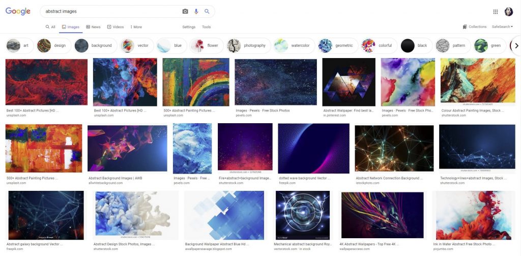
Before using a certain image, ask yourself why you chose that one specifically, and not a different one. If the answer is that the image helps convey some sort of information related to your business, then you’ve probably made the right choice.
The second rule is that if you show people, you should always show real people. Avoid abstract drawings and paintings, as well as stock photography, because these make people think of falseness and shallowness. On the other hand, seeing a real face doing a real activity will convince the user that what you’re doing is genuine and that your business can be trusted.
Abstract images don’t contribute much
Abstract images often don’t bring anything to the table. Yes, they’re interesting to look at and can be quite unique, but what you want is to be unique and stand out while conveying information. The second someone opens your website, you want them to learn everything about you in the shortest time possible, and what’s a better way to do that other than meaningful images with a purpose.
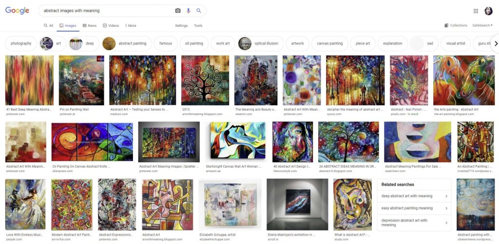
Abstract images still have their use in art-focused websites, but even then, the designer placed them there for a reason. Maybe they’re related to a story of an artist or are part of someone’s portfolio. They are also useful on websites that are specifically about their use and sell abstract images and templates. Anyhow, unless you’re an art-related business, you probably don’t want to use any abstract images on your website.
Images help increase conversions
We spoke about images that convey some sort of information or message, but what about images that evoke emotions?
People purchase things for a number of reasons, the main ones being making themselves or someone they know happy. Use images of your product or service that will evoke positive emotions in people, be it as simple as a person smiling and looking genuine while using your product.

These kinds of images also have the human factor, whose importance we mentioned in the previous paragraphs. Maybe you can add a picture of someone using your product but let people interact with it and spin it around 360 degrees, so they can see the product from all angles.
Another use of images that increases conversion are testimonial images. If users see happy faces with honest words, they will be convinced that your business is credible and will feel more comfortable buying from you.
But enough about images, this article is also about the use of colors on websites, so let’s see how people feel about those.
Users don’t like high contrast websites – truth or bust?
Right off the bat, high contrast sounds like an awful thing, doesn’t it? But in truth, high contrast on websites is more than welcome.
When speaking about high contrast on websites, we are speaking about the relationship between the elements, such as the background, the text, and the images, and when web designers use them correctly, they can look great and contribute to a good user experience.
High contrast website benefits
A popular high contrast theme is a completely white background paired with black text and colorful images of products. This use of negative space helps the products be the center of attention, so the user isn’t distracted by a colorful and abstract background. Websites also use a very subdued gray if they’re selling colorful products, such as clothes and accessories.
Minimalist websites employ the same technique.
While it is great for showcasing products, another benefit and why more and more websites are using high contrast themes is that it helps the visually impaired. As we get older, our eyesight deteriorates, so high contrast colors on websites can be of great help.
Low contrast for low conversion
If anything, I would say that low contrast websites are a worse option. Think of all the websites you’ve seen that have light gray backgrounds with text in a bit darker gray? It makes it very difficult to read and causes eye strain as we try to decipher what the text says. The same goes for mobile devices and low contrast websites.
How many times have you walked outside while it was sunny and had to look for a shade so you could read something on your phone? With high contrast websites, this is never an issue.
What are some bad choices for colors on websites?
Colors on websites are extremely important, especially background colors. We associate different colors with different things, therefore, when a website has a certain color for a background, when we visit it, we will have an opinion about it right off the bat.
Colors with high luminance, or stark colors, are there to capture our attention. Think of CTA or call to action buttons and how they’re almost always red. It is because red captures the attention almost instantly, so you can never miss the button. But, when it comes to websites, this isn’t necessary because someone already clicked on it, so there’s no need to try to capture their attention any longer.
When it comes to popular website colors, the winners are definitely white and a subdued shade of blue (think of Facebook, Twitter and LinkedIn). Other popular website colors are green, especially for environment related websites, and black, if the website is aiming for a sophisticated and luxurious feel.

Neons and bright colors are a bad choice
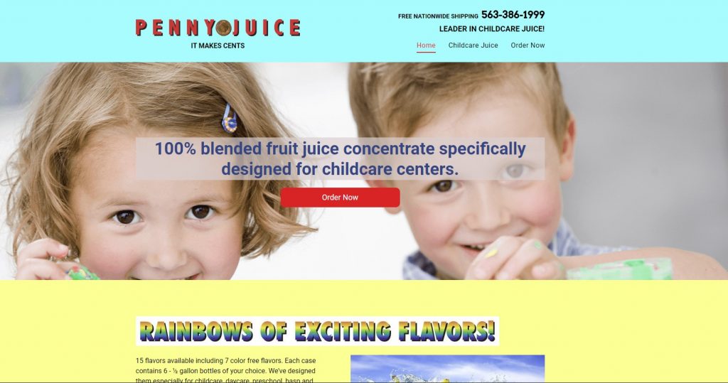
Bright colors are the least popular website colors. Users have said that they don’t like neon colors on websites, which makes perfect sense, because businesses use neons to attract attention. Web designers have also said that, from their experience, the worst choices for websites are pale yellow and bright blue. They called pale yellow unappealing, and when it comes to bringing blue, it is not only an eyesore but is also hard to combine with other colors.
Even though red is good when we use it for a CTA button, as a background, it makes our eyes hurt. The same goes for green backgrounds, especially if there’s yellow or purple text over it. If you really like one of these colors and if it is the official color of your business, web designers recommend that you either use it for website accents or as a desaturated version for the background.
Let’s look at some examples of high and low contrast websites.
High contrast website examples

Here’s a prime example of a business showcasing its products by using a high-contrast website. Oddsocks puts the focus on their unique and colorful designs by using negative space and no other elements that can distract from their products.

This website utilizes a vintage feel and a stunning design. The whitespace on top puts the logo into focus, and the big and bold font and text are complemented beautifully by the image on the right.

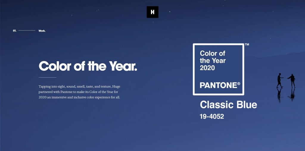
The designers behind the website of this digital agency utilized a bunch of bold colors for their backgrounds, such as green and yellow, but they balanced out the contrast, making every page readable and unique.

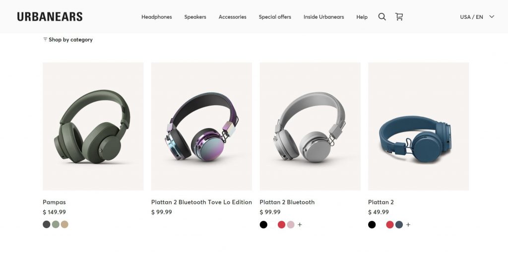
Urbanears used a minimalist and subdued design, making everything is easy to read and putting their products are the center of every page. The soft beige works wonders for products.
Low contrast website examples
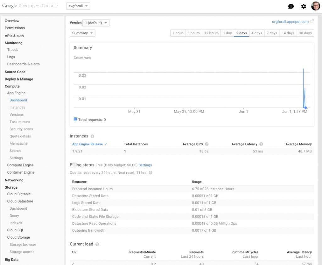
This is something that you absolutely don’t want on your website. The abundance of gray makes you think that most of the options are unavailable. If you’re using light gray as your background, at least make the text black.

The same example as the previous one, the background and text are too similar in color.

Aaaand, another one. The shade of blue is a great background choice, but the text needs to be darker.
Final word
While abstract imagery is definitely interesting and stunning, it has limited use when it comes to websites. It can make users think about its meaning, instead of letting them focus on the website and products. It is extremely difficult to convey a message with an abstract image, which is the ultimate goal of images on websites.
When it comes to colors on websites, definitely avoid using stark colors for your pages, such as red, bright green and yellow. Additionally, make sure that the contrast on your website is high, so all your text is readable and users don’t have to strain their eyes.
Thanks for reading!


