Websites come in all colors and layouts, but what is it that makes a professional website? Is it really the color, or maybe the background? Or could it be professionally taken photos and pretty fonts?
The essence of a professional website can be broken down into 6 characteristics, each equally as important as the other. When combined, these 6 crucial things help create the most professional website, both when it comes to appearance and performance.
So, let’s take a look at them.
1. Responsiveness – the first professional website parameter
Do you ever stop and realize how much more you use Google on your phone? You’re not the only one.
Desktop browsing is not as used anymore, especially because of the rise of smartphones. If you think about it, it makes perfect sense. People are busier than ever and they’re often multitasking and using their phone while doing something else at the same time.
Statistics show that more than half of all video streaming is done via phones and in 2018, 52.2% of all website traffic was generated through phones. And that number has only increased since. Additionally, 82% of people who use their smartphones to shop type in ‘near me’ into Google.

The importance of responsive design
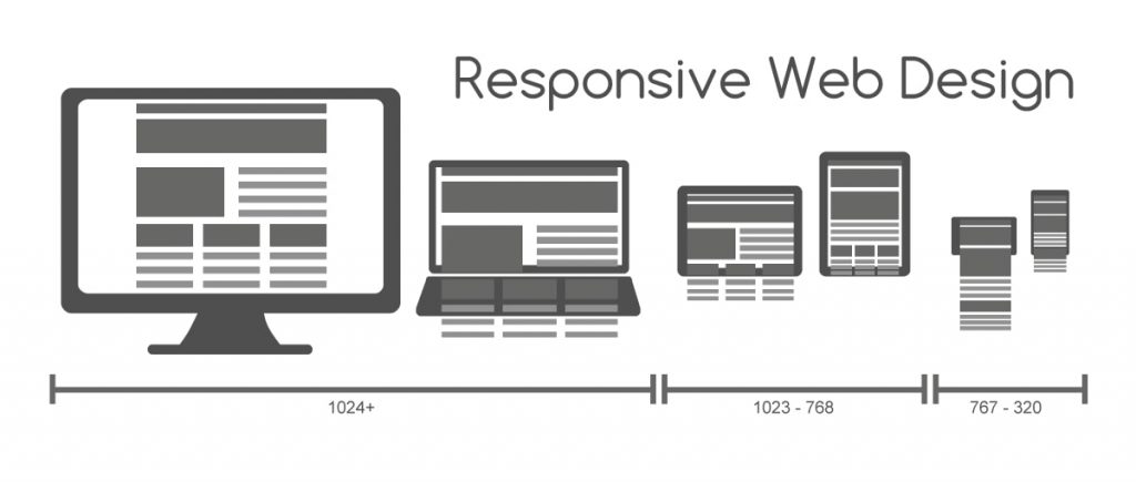
Looking at these stats, it is easy to understand why responsiveness has become such big a deal. If you don’t know what it is, responsive websites are the ones that are optimized to work on all devices, both big and small. In case of your website not being responsive, everyone who isn’t using their desktop will see a really bad version of your website on their device (if they can even open your website, that is).
If you want a professional website, you will need to make sure that the theme you’re choosing is responsive, or if you hired someone to build it from scratch, that they’re making it responsive. Big business or not, responsiveness is important for all kinds of companies and is one of the keys to a professional website.
2. Speed
Website speed is an often overlooked part when people are creating their own websites, and is more important than they think. People use page builders and move around text boxes and images until they see something they like, but they don’t even think about how slow the website they’re making is.
Large unoptimized images and videos can tank the website’s speed significantly, which is not great because it affects the ranking of the website on the search page results. Google has always placed its users in the first place, so if a website is sluggish, they will just decide that it’s not worth showing to the visitor. And how can you show your professional website to people if Google doesn’t deem it good enough?

What can you do to increase website speed?
It is true that the speed of a website depends on the visitor’s internet connection and their browser, but there are a few things you can do to make sure your website is as fast as it can be: optimize your elements such as images and video, clean up your code, and use only the plugins that you really need.
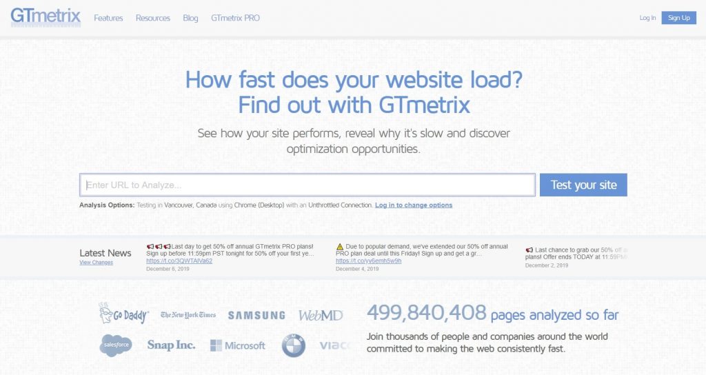
There are numerous free tools on the internet that you can use to measure your website’s speed (trust me, even experienced web developers use them).
3. Quality SEO
On the topic of things that affect your ranking on search engine pages, here’s another super important one: SEO. A good SEO is another important part of a professional website.
SEO, or Search Engine Optimization, is the practice of getting traffic through organic search engine results. It helps with the quality of traffic, as well as the quantity, so people who really want to buy your products will find you more easily and are more guaranteed to buy it. Also, the fact that it’s ‘organic’ traffic means that you don’t have to pay for it, opposite to the pay-per-click advertising you can do on search engines.

What does the SEO of a professional website look like?
There are many things that you can do to make your SEO better, some of which affect it more than others. Here are the most important ones: the quality and quantity of links on the website, content quality and relevance, readability and length of the content, and usage of keywords.
There are two types of SEO: on-page and off-page SEO, and both have their uses. On-page SEO is focused on keywords, titles, URLs, images, and the HTML code of the website. On the other hand, off-page SEO is concerned with the links both on your website and outside of it.
Mastering content
It is obvious how significant content is, but don’t stress over it, good content takes a while to master. Coming up with topics may be hard at the beginning, but you’ll get a hang of that, too.
You can always write about topics that you read about and what you know people struggle with. But whatever you write about, make sure that the content is useful to someone and actually helps and informs them, don’t just write for the sake of having content.
As you can see, well-written and interesting content is another important parameter of a professional website.
4. Memorable homepage for a professional website
We’re on the internet almost at all times of the day, so you’d think we’d be able to think of 5 really unique websites that we’ve visited. But the truth is that most of us just can’t.
When businesses design their websites, they go for the generic and safe solution: a large stock photo of some employees discussing something during a meeting. There are literally hundreds of thousands of websites that all look like this, and if you want a professional website, it is recommended to go for a more unique homepage design.
If your website is memorable, it is more likely that people will remember it, making it more likely that they’ll purchase something from you in the future again.

What is the current homepage design trend?
Minimalism has been popular in web design for a few years now and it is not going anywhere, by the looks of it. For a good reason, too, cluttered homepages can easily turn away visitors and make them never come back to your website.
Food-related businesses use a professionally shot photo of food for their homepage background and have a unique font to explain what their business offers over it. Digital agencies experiment with both optimized videos and cool graphics and make their homepages memorable that way, still maintaining the minimalist approach.
Clothes related businesses use simple and professionally shot photos of models wearing the clothes on one side and descriptions on the other.
Other elements of good homepages
Aside from images, there’s also the aforementioned graphics. If done professionally and are related to what you do, they can leave a lasting impression. They can also freshen up every page. Aside from graphics, there are also fonts. When choosing the typefaces for your website, make sure they fit your business, as well. If your business is technology-related, you definitely don’t want to be using outdated and old overused fonts, and especially not the fancy and vintage ones.

Hierarchy and scrolling
It is also recommended that your homepage is scrollable and presents the information in a simple and hierarchical way. For example, say something about your business first, and then list the services and products you provide, after which you will include a contact form.
At the end of a homepage is usually a map that shows the location of the business. Homepages also contain multiple CTA or call to action buttons.
You get the idea: well-shot images attract the idea and can be really memorable, and paired up with a nice and clean font maintain minimalism and display professionalism. Don’t forget to also make it aesthetically pleasing and use colors that work well together.
5. Simple and clear navigation
This professional website characteristic is related to the previous one, it’s about to the appearance of the website, but also has a technical side to it.
Navigations show the users important pages and the website hierarchy. There are a few tips when it comes to having clear navigation:
Don’t have more than 6 options (websites usually have pages dedicated to introducing themselves, describing their products or services, blog pages, contact pages, in that order). If you have dropdown menus, try to have under 6 links on them, as well. Keep it minimalist and simple and don’t overwhelm visitors with options.
If you look up ‘professional website’ you will see that they all have both simple homepages and navigations.

Breadcrumb navigations
When it comes to larger websites that often have hundreds of pages (think of Amazon), web developers use so-called breadcrumb navigations. They help people know the path they took to a specific page, in case they want to return to it. Breadcrumbs are very convenient for users, hence why websites with hierarchies use them. They are, however, quite useless for simple websites.
6. Privacy policy
In this age when websites are selling our personal data left and right, it is more important than ever than we know if the service we’re using is doing it or not.
Another sign of a professional website is a privacy policy, that tells users which data the website collects from them and what it does with that information. It is true that it’s not required to have one in every country, but it is good practice.
Why are privacy policies important?
If you don’t tell your visitors that you’re collecting their data, they will immediately become suspicious and think you have something to hide, so be honest with them. It’s better to lose a few potential customers than all of them. Ask your users if you can collect cookies, or inform them that cookies are obligatory. Whatever is the case, let them know.
Write the policy in a readable language and don’t make it convoluted. You want all your users to understand what you’re telling them; what you don’t want to do is to make them think you’re trying to trick them.
Final word
A professional website is so much more than just its appearance. Aside from the homepage, there are many more technical aspects that make a quality website, such as responsiveness, speed, a good SEO, and clear and simple navigation.
Don’t confuse your users with a website appearance just because you think it looks unique; minimalism is still king. Keep it simple and organized and good luck if you’re making your own professional website!


