Shopping is mostly done online these days. Online shopping not only makes everything easier but also unlocks thousands of possibilities.
Are you living in a small town that doesn’t have the brand that you like? There’s a high chance that said a brand has a website, where you can browse their products and order whatever you want.
Here lies the significance of having a website for your businesses. You want people to find you, and when they do, you want them to be able to see everything that you have to offer. But first, you need to make sure that your website is easy to use and looks good.
Let’s take a look at some great eCommerce websites and unique eCommerce business ideas that make life easier.
What makes a good eCommerce website?
Websites come in all shapes and forms, but there are a few characteristics that every eCommerce website needs to have. A nice appearance isn’t all there is, and there are far more important things that are a necessity when it comes to an eCommerce business website.
1. Good user experience
As much as you want your eCommerce website to be unique, it is best to keep it simple.
Buying stuff is simple, right? You go to a store, you choose what you want, you pay for it and you leave. It should be the same when it comes to an eCommerce business website. Your customer is there to buy something, not admire the unique artistic vision of your website.

Unique and experimental designs can make your website super memorable, but this is a very slippery slope. You don’t want to confuse your customers by hiding your navigation or making it super hard to find. Honestly, they might just get too frustrated, give up and close your website and look for a similar one.
To find out if your website is user-friendly, you can always ask a friend to objectively tell you what they think of the current design and if they think it’s user-friendly. Ask them how long it took them to find their way around and purchase a product and if it was a good experience. If they had any difficulties, think about them and how you could improve them.
Additionally, there are hundreds of thousands of eCommerce websites out there that you can use as an example. See how they designed their websites and write down what you liked about them. In the end, add your own twist to it. It could be a color, a graphic, or a unique way of showcasing your products.
But whatever you do, make sure your website is usable.
2. Good design
Good design goes hand in hand with a good user experience.
Your website being easy to use means almost nothing if it’s bare bones. If it’s too basic and has nothing unique, it can be super forgettable to your customers, who can let it slip from their memory and not come back to purchase something again.
Colors and presentation
Make sure that your website uses the appropriate colors. For example, brands that are focused on organic food usually have lots of white and green hues, and luxurious brands always put the focus on black.
Similarly, brands marketed towards men utilize shades of blue, while brands marketed towards women use hues of pink and red. If your brand has its own color, it should be utilized in some way. If not as the background, then as one of the accent colors.

Next up, presentation. You want your products to be shown in the best light possible, which you will achieve by hiring a professional photographer. It’s true, phone cameras these days are super powerful and you can snap a few photos with your phone, but how much do you actually know about proper lighting and how to create it?
Hiring a professional will ensure that your products are presented in the best light possible.
Simplicity and usefulness
When it comes to the overall design, for the past few years minimalism has been one of the main web design trends. And when talking about eCommerce, it’s a safe solution.
Ecommerce websites use simple designs but add unique color combinations and cool elements such as parallax scrolling, micro-interactions, funny descriptions (think of gift websites) and many others. All of these make them more memorable and enable them to stand out in a sea of competitors.
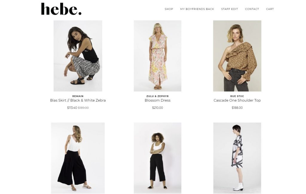
A good design also includes good and detailed product descriptions, so your customers know exactly what they’re buying. Also, a search box, so they don’t have to waste their time and can look for something in the matter of a few seconds.
Some other key elements of a good design are a simple checkout process contained to one page, a shopping cart with all the important information and changes that can be made (quantity, shipping and purchasing methods, etc.) and others.
Great eCommerce ideas and their websites
1. Warby Parker
This eCommerce business was founded in 2010 by four friends who wondered why glasses were so expensive. They decided to make a business that would make glasses more available to people, but also eyewear that was more fashionable.
But this isn’t the only reason why they because so successful so quickly.
If you like eyewear, you know how much of a hassle buying it is. First, you need a store with a good selection and then you need some space and a bit of privacy to try on different glasses, which is really hard to find in stores.
I don’t know about you, but my personal nightmare is trying things on in front of other people. If I could try glasses on in the privacy of my home, it would make it so much easier.
The Warby Parker founders realized this and came up with a great system. You can choose five pairs off their website (with a huge selection, may I add) that they will send you so you can try them on for free. You have to admit how convenient this is. You get to try glasses on, wear them around the house for a while, really test out the shape and decide if they fit you or not. Afterward, you pay only for the pairs that you decide to keep.
The Warby Parker website
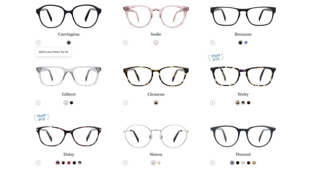
Not only is their service unique and useful, but their website is also as sleek as its eyewear designs. Let’s take a look:

It’s simple and effective. The minimalist design is complemented by the photo, and the color scheme is consistent: note how the black font matches the sweater, and the background matches the blouse. White space is used smartly, so the navigation isn’t hard to find and the products are put in focus:
2. Dollar Shave Club
We’ve spoken about this service before, but it’s just that good and worth another mention.
This subscription-based brand is among the most popular grooming services, and for a good reason too. They deliver high-quality razors, blades, and grooming products right to your door, for an affordable price. But why is this a good eCommerce idea?
It’s simple: buying razors is a huge hassle. Every few months, Gillette releases a new razor, with some new amazing features. And if we’re being honest, they’re not cheap at all. Dollar Shave Club saw how much people hated wasting their time in the razor isle, staring at shelves full of different razors.
So, they decided to simplify this process, save you some time and deliver some great blades to your home. The ingenuity of their eCommerce idea is similar to the one of Warby Parker: convenience.
The Dollar Shave Club website
The Dollar Shave Club website is stunning. It is so very simple but executed in such a great way. What first captures your attention on the homepage is the video that starts playing. It features a great deal of diversity, sending a positive message to everyone who visits their website.

Below the video is a picture of some of their products, and you will immediately notice how minimalist and nice the package designs are. Now, for the product page:
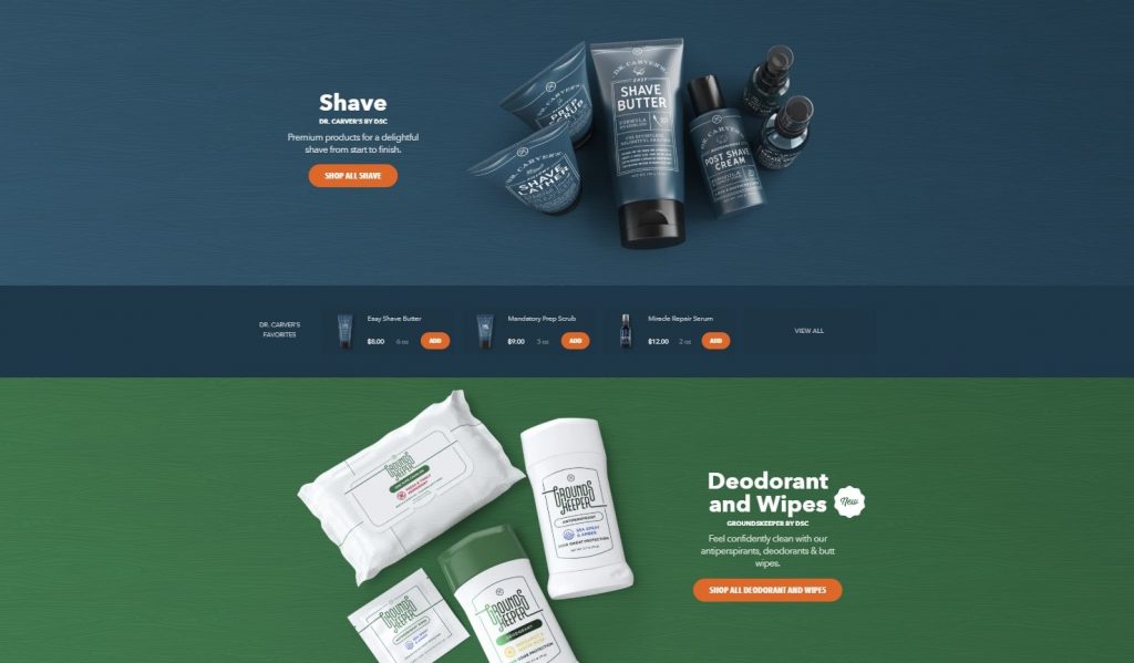
The colors of the products match their backgrounds, which makes for a very aesthetically pleasing page.
3. Weebly
Here’s a bit of a meta example, but nonetheless a great eCommerce business idea.
Weebly is a web hosting service focused on eCommerce that allows people to create online stores for their businesses for affordable prices.
What made Weebly so popular was not only the rise of online stores and shopping, but also how easy it is to use. They allow you to drag and drop elements on your eCommerce store, making the process easy and simple.
The founders saw the popularity of eCommerce rise and they seized the opportunity. They made it possible for thousands of hundreds of people to create their own online stores for their businesses. None of those people had to spend months learning code and made their stores in the matter of hours. Again, convenience.
The Weebly Website
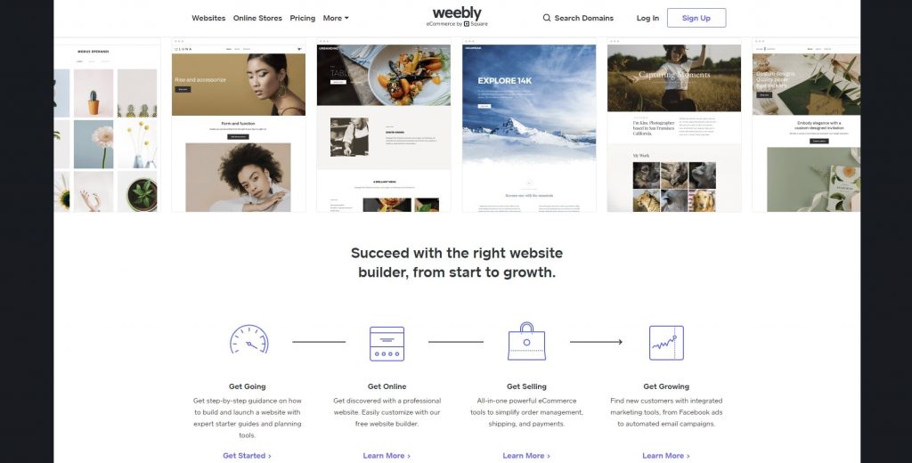
Just like the previous two website examples, this one is minimalist, as well. The color scheme is similar to the one of Warby Parker: there’s a lot of whitespace, black and beige. Not the most unique design, but that’s not what they’re aiming for: by showing you their simple website, they’re telling you that you can make one that is just as simple and sleek.

I also love how they give you a taste of their portfolio immediately: you can see the different businesses that have used this service, which tells you that Weebly makes successful online stores for a multitude of business types.
Wrapping up
If you’re making a website for your eCommerce business, make sure that it has a good user experience, a nice design, coordinated color use, and unique presentation. Additionally, you want it to be as simple as possible, to improve user experience and make it as smooth as possible.
Warby Parker, Dollar Shave Club, and Weebly are different examples of successful eCommerce businesses, but what they all have in common is convenience. Warby Parker enabled people to try on glasses in the comfort of their own homes, Dollar Shave Club saved people a bunch of time, and Weebly enabled them to create their own online stores.
Whichever idea you have in mind, we hope that your eCommerce business reaches the same success. Thank you for reading!


