What is a website footer and why is it used?
As the name suggests, website footers are website sections that can be found on the very bottom of the pages.
At first thought, they might seem insignificant and unnecessary, but they’re more important than you think.
They not only provide additional space for information that you weren’t able to place anywhere else on the page, but they also provide a better user experience.
If the pages of your website are especially long, instead of scrolling all the way back up, visitors will be able to click another page that interests them provided in the footer. This makes their experience on your website much smoother.
Because of these benefits of website footers, they will be today’s topic. We will talk about the elements that make up modern and useful footers, and afterward we will look at some great website footer examples.

Website footer elements
Website footers differ in sizes, styles, and content, but what they all have in common is the abundance of information they contain.
But despite the fact that they can contain a ton of information, try not to go overboard and include only what you think is necessary for your visitors to find their way around your site.
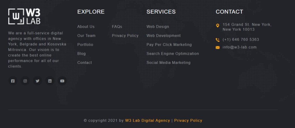
1. Contact information
It’s true that websites place their contact information in one of the links located in the navigation, but the footer is another great place to tell your visitors how they can reach you.
If you think people don’t notice footers, trust me, they do. Back in 2012, Smart Insights increased the sales conversion of one of their clients by 23.77% just by optimizing their website footer.
Include your email and phone number that customers can reach you through if they’re interested in what you have to offer.
2. Addresses and maps
This element goes hand in hand with the contact information.
Include your address and a small Google map of your location in the website footer, to let your customers know where you’re located.
Every website nowadays has a map, and businesses with multiple locations include maps that have all of them. Visitors are able to interact with them and zoom in and out to get a better idea of the locations.

3. Navigation
Remember how I mentioned earlier that footers can contain website navigations, which make the lives of your visitors much easier?
Because of that, they’re one of the most important website footer elements, so make sure you include your website’s navigation in your footer.
You don’t have to make it detailed and include every single submenu link. Instead, keep it simple and include only the main pages, such as ‘about us’, ‘services’, ‘blog’, and such. When your visitors scroll to the bottom of the ‘about us’ page, they will be able to immediately click the ‘services’ page, without the hassle of scrolling up.
4. Testimonials
While some websites place testimonials on a special section of their homepage, some prefer to have them in the footers.
These are usually short testimonials without images of clients and are 2-3 sentences long max. Placing them in the website footer is ideal if there’s no space on the homepage, and if the footer has a ton of space left.
5. Newsletter signups

The footers are the website’s favorite spots for newsletter signup forms. Instead of interrupting visitors mid-reading with a sign up for our newsletter popup, website owners include a newsletter signup form in the website footer instead, making it less annoying.
They usually contain one empty box where the visitors put in their email and a call-to-action button next to it, which allows the visitors to sign up for receiving the newsletter.
6. & 7. Sitemap and copyright
Here are two small footer elements: the sitemap is there to help search engines find things, and the copyright line is a defense against plagiarism.
8. Privacy policy
Usually preceded by the copyright line, a link to the privacy policy is a necessary part of every website today.
It is important that you tell your visitors if you collect their information, how you use it, who you share it with, and for how long you retain it. Don’t be secretive about any of these, because if you are, your visitors might think that you’re selling their information behind their backs and won’t trust your website and visit it ever again.
9. Terms of use
Similar to the privacy policy, a terms of use link contains rules related to all the content on a website and is most often included in the website footer.
The list of rules describes if and how visitors can use the content of a website, if they’re allowed to share or modify it for their needs, how any unauthorized use is handled, what kind of content they’re allowed to post on the website and what their comments can and cannot contain, and so on.
Some websites combine the privacy policy and the terms of use and have them on the same page.
10. Social icons
Social media icons and links enable your customers to find your social media accounts so they can follow you and interact with you and your posts. People are following brands on social media more than ever, so be sure to include social icons in the website footer.

11. Previews of blog posts and photos
Sometimes, if there’s no space on the homepage, websites include a small preview of their most recent blog posts in the footer. This is a rare occurrence, but it can still be found.
Same goes for image previews: if the business has a section of a website where they upload photos from events, they sometimes make a small album preview in the website footer that you can click and get a better look at the photos.
12. Awards and partners
Who wouldn’t want to proudly display all the businesses they collaborated with and all the awards they have won? And what’s a better place to do this other than the top of the website footer?
These two forms of social proof tell your visitors that your business is credible and can be trusted. This is why collaborations are so useful, especially with businesses that are more known than yours.
5 great website footer examples
Now that you know all the important website footer elements, it’s time to look at some great and modern website footer examples.
1. icons8

The footer on the icons8 website is as simple and modern as it can be. The dark grey background looks good with the text, that turns white when you hover over it.
There’s a lot of navigation links, but it doesn’t look overwhelming because everything is separated into coherent parts. On the bottom left is the copyright line, and in the middle are links to the Privacy Policy and Terms and Conditions. The newsletter form is on the bottom right, with an effective green call-to-action button.
2. Angee

The footer of this site includes the logos of the websites that have articles about the Angee product. The logos are famous and recognizable, so including them was a great move on the designer of the website.
If you click the logos, you will be taken directly to the articles, where you will be able to read what these big names have to say about the product.
The rest of the footer includes a short and clean navigation, a copyright line and two small social icons. Modern and effective.
3. Wire

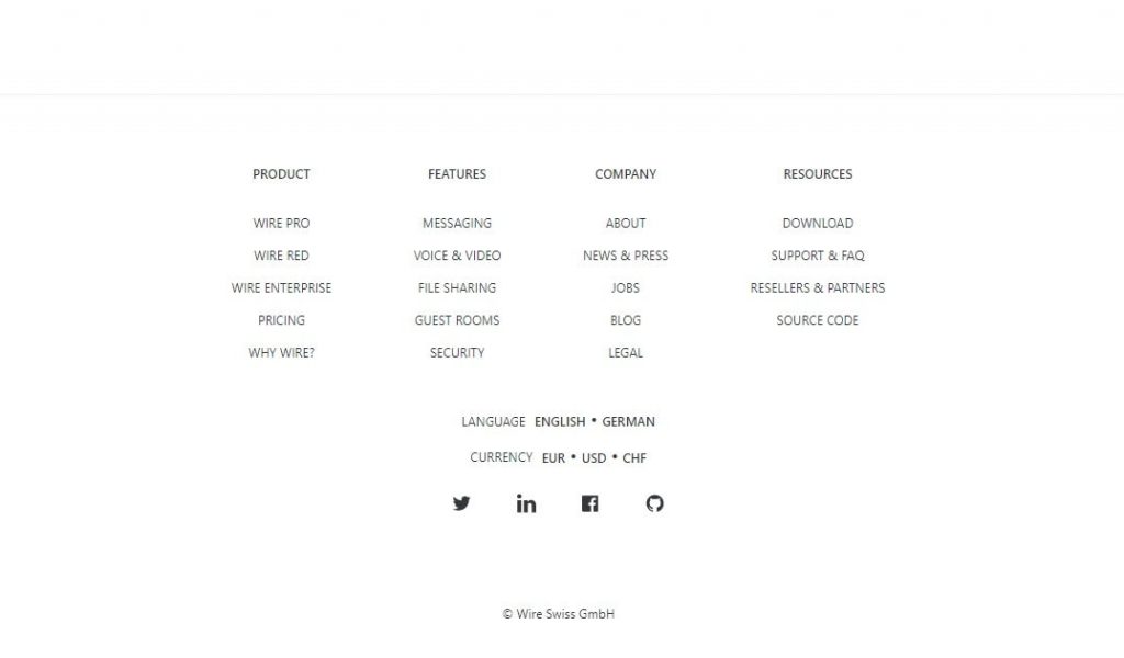
This highly minimalist footer uses a center alignment, which is very aesthetically pleasing. As for the elements, it contains a navigation, social icons, and unlike the previous two examples, language buttons.
4. DeployBot

I chose this example because it is vastly different to the previous ones. The copyright is on top, and the navigation links right underneath it. They are then followed by links to guides about the DeployBoy, that the visitor can click should they reach the bottom of the page and are interested in learning more.
5. Arise

This footer contains a contact form, so you can message the business if you want to work with them. The contact information on the right contains everything it should: a phone number, an email, and social icons.
On the bottom right are links to the credits and the privacy policy, as well as their location.
Conclusion
All websites and footers are different, but they should always contain elements such as contact information, navigations, addresses and maps, and social icons.
Other optional elements include testimonials, sitemap, privacy policies, terms of conditions, blog and image previews, and awards and logos of partners or clients.
It depends on your website’s appearance and personal choices which optional elements you will include in your footer.
Thank you for reading!


