No matter what website style may currently be relevant, clean and modern web design is and always will be a trend. Empty space, clever use of colors, interfaces that are easy to navigate and legible fonts have always been utilized in order to achieve the simplest and most beautiful websites.
Just because something is simple, doesn’t mean that it’s missing any components. On the contrary, simplicity and minimalism are actually quite difficult to get right. In this post, we will go through the elements of clean and modern website design that combined, will create a website for your restaurant that your customers are guaranteed to love.
What does a clean design consist of?
Before we get to the technicalities, let’s first look at two great restaurant examples. Here’s UrbanDine and SanGarden, two website templates:

As you can see, the homepage for UrbanDine is pretty simple. A large colorful photo of a dish with some modern fonts for the text and call-to-action buttons. Simple, but effective. The photo is there to immediately show you what kind of food they make and the call-to-action button is the most prominent element of the page, so you find it as easily as possible.
Here’s what you see as you scroll further down:

You’ll notice that it is very image heavy, and that all images are high quality. There’s a lot of empty space, with the purpose of putting the focus on the images. The white background perfectly enables the photos to stand out and be the focal points.
Let’s move onto SanGarden:

The homepage is different from the previous example, but we can see the pattern: big images, clean fonts, high-quality photography, lots of empty space.
This homepage, however, uses the principle of symmetry and is separated down the middle, creating an aesthetically pleasing appearance. The green used for the text and sidebar isn’t just any shade: it is the green that dominates the photo.

The rest of the homepage has the same theme going on: the photos all have the same filter on them in order to create the effect of unity, they have even used the same typefaces and the same shade of green. This creates consistency and harmony.
What do these two great websites have in common?
As you can see, there is a bit of a theme going on: both websites have a clean and simple design. There’s a lot of empty space, which draws attention to the right elements, and they have a small selection of fonts, with the purpose of legibility. Additionally, the images used on both are high quality because they need to showcase the food in the best light possible.
They’re characterized by minimalism, which is all about the removal of things that clutter the website in order to achieve simplicity. No customer wants to visit a website, get confused by the layout and leave.
The challenge of clean design is to maintain a minimalist look while still keeping all the information that is necessary to a customer. A website of a business of any kind must have the location, opening hours and the list of services they offer. In the case of restaurant websites, however, you must let your customers know what your restaurant offers in just a few seconds of them looking at it.
This includes the kind of food and meals you have because no one likes or has the patience for clicking around a website to learn about the most basic thing. Make it clear what kind of cuisine you offer. Most websites change their front page weekly or even every day to include an image of a special meal or offer.
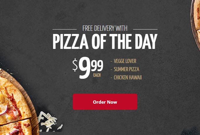
The website for Pizzaro is not only clean but it also only includes a special offer, which is very minimalist itself. The font is easy to spot and read, the white color and size attract the eye of the customer, the pizzas are listed so the customer won’t have to click anywhere else to find them. The color scheme of the fonts and the button matches the colors of the pizzas, which is very aesthetically pleasing, as well.
Now that we’ve learned what the important role that minimalism and clean design play in restaurant website design, we can move on to the elements of clean design.
Elements of a good design
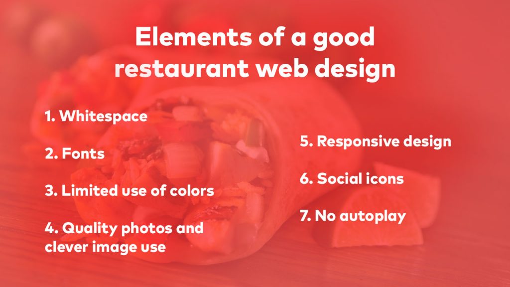
1. Whitespace
Whitespace, also known as negative space, is the space between the elements of your website. But just because it’s empty space doesn’t mean it’s useless.
Whitespace increases legibility and makes it easier to navigate and read websites of any kind. It also helps redirect the attention of the customer to the things you want them to look at: the services you offer or any special deals you have going on at the moment. So, instead of making images and fonts bigger, whitespace around them can make them stand out, as well.

Take a look at the website for Sneaky, for example. There is whitespace everywhere, but it doesn’t look empty. The layout is clean and easy to navigate. Their social media links, despite being tiny, are still easy to notice. The buttons on the bottom let the customer know what their priorities are: fast delivery service, fresh ingredients and 24/7 support. Taking up the other side of the screen is a picture of a meal with a beautiful presentation. This is an excellent example of clean and modern website design.
2. Fonts
While it is true that dramatic and bold fonts capture attention immediately, it is important not to overdo it when it comes to typography, just like everything in minimalism.
The size of the font has always been used to indicate hierarchy and that something either comes first or is more important than a previous part. In this case, there is some text that simply must be bigger than the rest. This is usually the name of the restaurant, or like in Pizzaro’s place, their special offer.
When choosing the font the name of your restaurant will be in, make sure that it matches your brand. Fancy fonts fit some restaurants, old-timey fit others, while some go with more modern looking fonts. Overly fancy fonts should be avoided because you want everyone to be able to read the text.
When it comes to combining different fonts, you should never use more than three types. Choosing more can make your homepage look disorganized and chaotic. Also, make sure that they all fit the theme, because choosing a fancy font often won’t look good combined with a funky one.

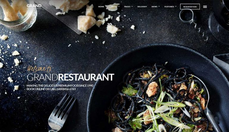
Take a look at the website for the Grand Restaurant. A photo of their food is used as the background, but it still leaves space for all the information. The font is white and beige, standing out on the almost black background.
They effectively used two different fonts: the fancy one is purely decorative and only two words are in it, while the majority of the text is in the clean font. In this excellent example for a clean and modern website design, they achieved uniqueness while maintaining legibility.
3. Limited use of color
Less is more, and color in web design is no exception.
Colors can often distract from important information, so it is important to be subdued when using them. Using a monochromatic color palette or just a very limited one are the main ways to achieve a clean design.
It is advisable to use bright font colors on dark backgrounds and vice versa. Some designers choose a bright accent color, like pink or green, and match graphics and fonts. Some even use these colors for backgrounds, which is a bold move that in some situations can look quite good.
The most important thing is to keep the contrast between the text and background high, because if it is low, it can lead to poor legibility. Hence why all of these websites have either really dark backgrounds with white text, or vice versa.
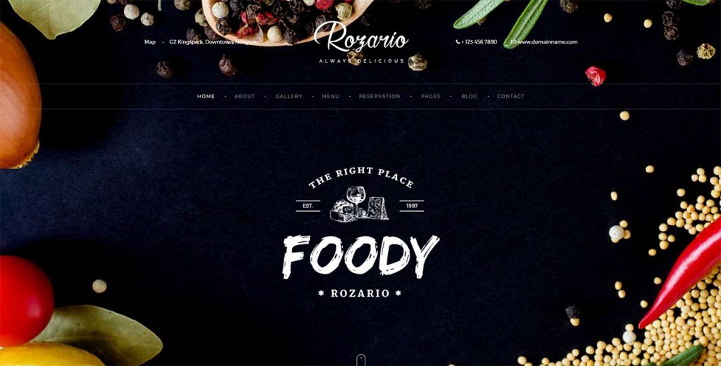
A great example is the Rozario website. The background is black, with a white font. The vegetables add a little bit of color and decor, but are not distracting. Their logo in the middle still stands out, also colored white. All the information is on the top, so there is no need for scrolling to learn anything about them.
Just like bright colors can add a lot of energy to a website, warm colors can do the same thing with the use of interesting shapes and graphics. Another tactic web designers use are colorful fonts on grayscale background images.
4. Quality photos and clever image use
Minimalism is all about clever image use.
When we take a look at the previously mentioned examples, we can spot different image uses. In the example of the website Sneaky, the image takes up half of the screen, and even though this is a lot of space, it does not distract from anything else. In fact, it is quite welcome, because a restaurant website should have images of their food.
Grand Restaurant uses a photo of their food with a smart composition for their website, which is a clever idea. They used the black table as their whitespace in a way, and, while showcasing their food, left enough space for all the text. Despite the lack of whitespace, all the elements are still clearly distinguished.
The image Rozario used is not of a meal, but this is done on purpose. They used fresh ingredients and spices instead, which is quite a unique approach.
But static images are not the only option.
The use of moving images and graphics has significantly increased, since it intrigues and captures attention easily.
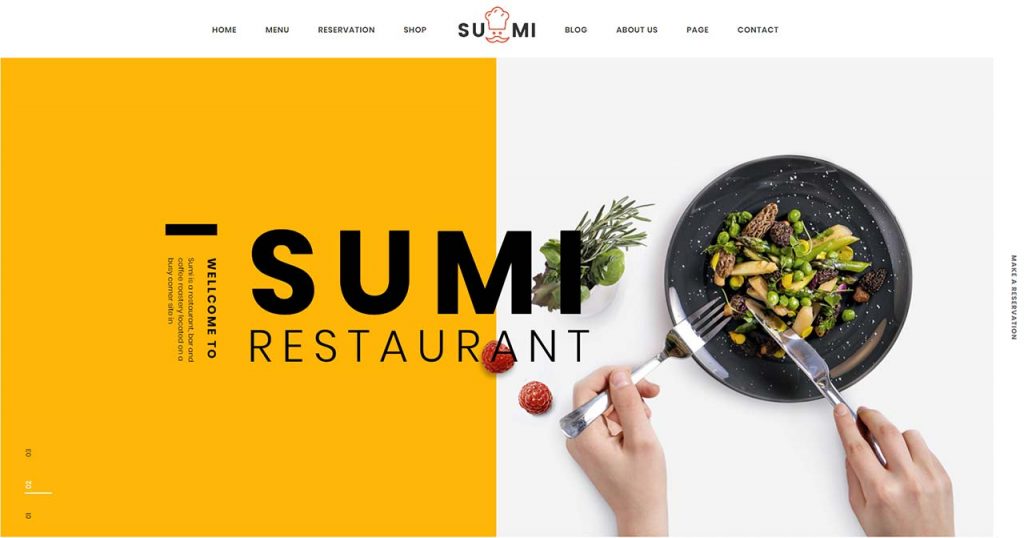
Take a look at the Sumi Restaurant website, for example. There is an interesting cascade and fade effect that happens and changes color. Both the red and yellow look great and fit their theme.
5. Responsive design
But having a pretty website doesn’t mean anything if people cannot open it on their devices. Make sure that your restaurant’s website is responsive.
Responsive web design refers to the practice of making a website have a nice appearance while maintaining good performance on all devices, no matter how big or small they are. This includes having images and fonts that look good and can also scale according to the screen size.
There are multitudes of WordPress themes you can use for your website that have fast performance, look great, and are responsive. They can be pretty useful when it comes to looking for design inspiration, as well.
6. Social icons
These are a must for every business, especially restaurants. If you wonder why, the answer is quite simple.
People look at social media profiles of restaurants all the time. They want to see what the atmosphere is like, how often they update their social media, what their food looks like, etc. They also visit the restaurant hashtag, to see the pictures that people post from the restaurant.

Social media is also another way of interaction, so people can reach out to you through it and make a reservation or ask a question about a dish.
To make it easier on people to find you, make sure to include your social icons on your website.
7. No autoplay
Everyone loves music, but no one likes unexpected music that surprises them with loud volume. Same goes for quiet music people cannot tell where is coming from.

The option to have autoplay on your restaurant website might seem appealing, because you have a great playlist that perfectly fits your restaurant’s atmosphere, but trust me, you don’t want to do it.
People click out of websites with autoplay with record speed. It is probably one of the most annoying things a website can have, so avoid it at all costs.
What makes your restaurant unique?
In marketing, there is a term called differentiation, which has the aim of helping a business stand out from its competition. Nowadays, this is crucial because every market is getting more saturated by the day, and being unique means everything if you want people to choose you over your competition.

Think, is your restaurant different from all other restaurants in that area? Does it offer a special dish or drink that cannot be found anywhere else, or maybe it has a unique interior that people will absolutely want to visit and see for themselves? This is the ace up your sleeve, what will differentiate you from your competition.
You can use differentiation for your website, as well. If you make your restaurant website more unique, it will be more memorable than other restaurant websites. So, the next time someone is trying to decide where they want to go, your restaurant might just pop up in their head before any other because of your unique website design.
Two unique restaurant websites
Here’s another 2 great restaurant website templates, Motto and Food Truck.

If this is not a memorable website, I don’t know what is. The minimalism is a bit extreme, but it works. You open the website and in 2 seconds, you know what kid of food they made and what their working hours are. The border in stark yellow is not something you see every day, either. Very unique and cool.

Right off the bat, this is the most unique website in this whole post. There’s no white or black background nor a photo of food, instead, it is a photo of a food truck in an interesting shade of purple.
In the middle of the screen is the name of the food truck, so people can find it easily in the street. Look what happens as you scroll down:

The purple background moves and gives way to this amazing photo of a burger, which, I have to admit, made me really hungry almost immediately. If this was their goal, they have succeeded in it. The purple and yellow can be found throughout the entire page, achieving consistency and leaving a memorable impression.
Conclusion
Today, it is almost necessary to have a website for your restaurant. It not only helps people find you but also offers them information about your business and gives them the option to order online or reserve their tables.
Find more about: How fast food restaurant website design should be?
It is of equal importance to have a website that is easy to navigate and looks good. No one has the patience for websites cluttered with images, buttons, and text, so the minimalist option with the clever use of whitespace, fonts, images and colors is the right and best choice for your restaurant.

