An important thing to consider when it comes to design is choosing the best website color scheme.
The right colors can make a website look professional and trustworthy, and even add some personality.
But what are the best colors for a website? That’s what we’re going to explore in today’s blog post. Trust us – you want to take advantage of this critical information.
Here are the most popular color schemes for websites, along with some tips on how to use them effectively. So, let’s dive in.
Why is a good website color scheme important?
A good website color scheme is important because it can influence how visitors interpret what they see.
It can also stir emotions, giving an opportunity to achieve the emotional state that is found desirable.
This ability to influence and control psychological aspects of a prospect’s perception opens vast possibilities.

On the other hand, too many colors or clashing colors can be overwhelming and distracting for users. A good color scheme should be easy on the eyes and make it easy for users to navigate your website.
According to studies, the mental impact of colors is so great that colors boosted brand recognition by an average of 80%. For example, think of Coca-Cola, and you’ll probably imagine its famous red color.
It is also important to consider the target audience of your website when choosing colors.
For instance, if you are targeting a younger audience, you may want to use brighter, more vibrant colors. But, if you are targeting an older audience, then you probably want to use warmer, more subdued colors.
Different colors are appropriate for different niches. For example, common choices for law firms include shades of blue, grey, and white.
With careful consideration and planning, however, you can create a color scheme that will not only look great but also help boost your website’s popularity and success.
What is a website color scheme?
A website color scheme is a collection of colors that are used together on a website.
These colors can be used for different elements on the website, such as the background, text, and links.
When choosing a color scheme, it is important to think about the mood you want your website to convey.

One common way to create a color scheme for a website is by using primary and secondary colors. This gives the site a cohesive look while allowing for variation in color.
A primary color is typically used as the background or for the website’s logo, while a secondary color is used for accents throughout the site. The two shades of each color can be used for different elements on the page, like text and backgrounds.
In addition, consistency is actually one of the core values in creating a color scheme for your website.
Since brand personality is so crucial to a successful website and business, a consistent color palette reinforces your brand identity, as your repeated use of color and style will create associations between your brand and your audience.
How to choose an appropriate website color scheme for your website in 5 steps?
Deciding on a color scheme for your website can be a tough decision. After all, the colors you choose will be representing your brand, so you want to make sure they’re saying the right thing.
So, here are 5 simple steps for finding website color schemes:
- Find your primary color
- Find your secondary and neutral color
- Background color
- Choose a typeface color
- Useful sites for finding website color schemes
First step: Find your primary color
If you’ve owned a business for a while now, it is highly probable that there’s a color you already associate with your business, which makes this step easier and faster.

This color will be not the background, but the color of important buttons:
- such as download and CTA buttons,
- special text (text promoting something),
- important links (menu links),
- the super important stuff that you want the user to notice.
If your brand is concerned with health and food, the accent colors frequently used for these websites are green and its hues.
Brands related to luxurious cars and clothes usually go with good old black and white, while brands that are oriented toward products for youths have colorful and vibrant website color schemes.
For example, blue is most often used for social media and ‘serious’ websites, such as banks, airlines, and medical sites, as it is the color of stability and trust, while orange is the color of happiness, joy, and creativity.
You can always look up the meaning of colors, this could be of great help when choosing your primary color.
Here’s a useful quiz that you can take that will help you find the right primary color for your brand.
But in the end, it all comes down to personal taste and your vision. Look at how the primary color of our website is purple, we could have gone for blue, which is the safest choice, but purple is so much rarer and more unique.
After you choose your primary color, it’s time to choose your secondary color and neutral color.
Second step: Find your secondary and neutral color
Just like primary colors are used for important buttons, a secondary color is there for less important things. Its purpose is to add some more color and liven the website up a bit.
You can always go for the safe option and use a darker hue of the primary color, but if you want to go for something different, you can choose a color that contrasts with the primary color.

For example, blue and orange are complementary, but completely different and create a unique effect.
When it comes to neutral colors, these colors are used mostly for the background. It’s usually white or different hues of grey and black. Select one that looks best with the secondary and primary colors you’ve chosen.
Third step: Background color
If there’s a color you associate with your brand, you should never use it as a background color.
Web designers avoid using primary colors as background colors because they’re usually bright, which makes sense because their role is to attract attention.
It is okay for artistic websites and it can look good, but not for eCommerce and serious business websites.
What is a good background color for a website?
Bright colors being used as backgrounds would put a strain on the eyes of the visitor, and if you really like your brand’s color and want to use it as the website background, make it a darker hue and use the bright version as the primary color.
In addition, white is recommended as the absolute best choice, because it will make your products come into focus. By making the background white, all of their pieces can stand out.

Designing a button with a font color that contrasts with the button’s background color will make the button text a lot easier to see.
This can often result in higher clickability and conversion rates, and the same is true for navigation menus and menu items.
Fourth step: Choose a typeface color
Choosing a typeface color is an important step in designing a website. While black might be the easy choice, it’s not as common as you’d think.
A black typeface on a white background can lead to eye strain, as there’s a 100% contrast. People will be more likely to click away if your website is difficult to read.

Explicitly colored typefaces are typically used to highlight important information on a page, but you can use gray or tinted versions for more soothing effects.
There isn’t much room left in the design process when it comes to this choice. However – just be sure not to use garish neon hues as they will only serve one purpose: making everyone feel uncomfortable.
Related: Types of fonts in web design.
Fifth step: Useful sites for finding website color schemes
If you still need inspiration for your website color scheme, the website color scheme generator can be the best way to find unique and professional colors that will work for your design projects.
Some of these useful sites for finding color schemes are the following:
With so many great resources available, there’s no excuse not to find the perfect color scheme for your next website design project.
Need help in building your website?
Top 7 websites with good color schemes (our choice)
Picking the perfect color scheme for your website can be a tough task- there are just so many options out there.
If you’re feeling overwhelmed, take a look at these seven sites with beautiful color schemes. From soothing blues to vibrant pinks, you’re sure to find something that inspires you.
1. IC Creative (#FB8122, #1D2228, #E1E2E2)
IC Creative‘s website is a bright and inviting space with an accent color that calls attention to itself.

The dark overlay provides enough contrast for users, while still allowing other contents on the screen to shine through without being overwhelmed by its brilliance or brightness alone.
This allows visitors not only to see what they’re looking at but also helps them understand all of the information provided within each page as well.
2. Omega Yeast (#F7F7F7, #7DA2A9)
This website design does something that is a big idea in color trends.

Omega Yeast scheme taps into the current popularity of using full-screen images for branding stories, which can be told more effectively with just one main image rather than many small ones on different pages or backgrounds.
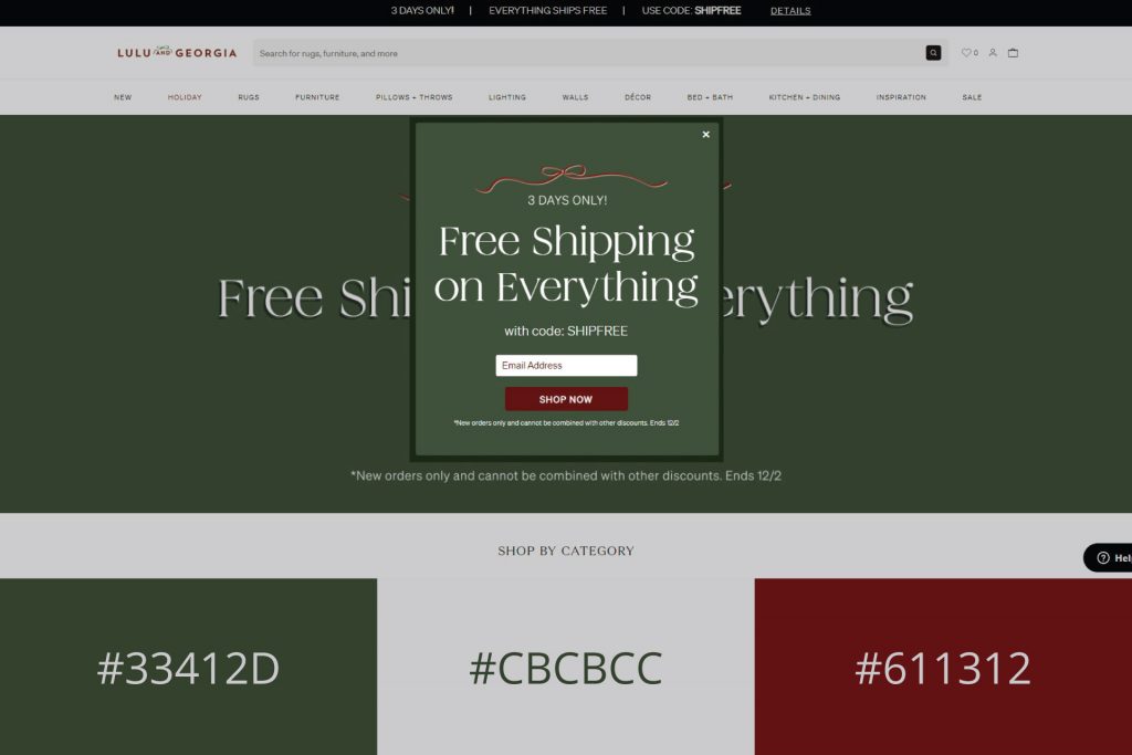
3. Lulu and Georgia (#33412D, #CBCBCC, #611312)
Here’s something more subdued and minimalist. Lulu and Georgia furniture website keeps it simple.
Call it simple, but uniformity is actually really hard to achieve. Look at how nothing stands out and how balanced everything is.

Beige, orange, and brown tones dominate their website, with a lot of white space, so the accent is on the furniture and photos.
4. History of Icons (#165B59, #EC277C, #CED6D0)
The homepage opens and you’re greeted by a bunch of colors, none primary.

There are different shades of fuchsia and teal and a bit of white. Undeniably unique shades that you don’t see every day, even less together.
As you start to scroll down, you’re presented with the History of Icons. The 80s are teal, the 90s are fuchsia, the 2000s a cool shade of green, and the 2010s a deep blue.
Despite such a multitude of colors, no part of this website looks overdone and like an eyesore.
It shows you that there are still unique website color schemes out there that are not overdone to death.
5. Sirin Labs (#000000, #39BDADWrapping up #FFFFFF)
Despite it not being colorful, it is everything but boring. They used turquoise as the accent color, putting it on the buttons and also on the text when you hover over it. But this is not all.

As you scroll down, you’re in for a surprise. Sirin Labs used other colors, bold ones at that.
The yellow looks great with that shade of dark turquoise, and the pinkish hue in the row below compliments this part of the page.
6. Cowboy Bike (#000000, #FA255E, #C39EA0, #F8E5E5)
The bright colors of the Cowboy Bike logo are an attention-grabbing and fun way to make their brand stand out.

While most websites use black text on a background with dull shades, this design uses it in conjunction with bold monotone hues that will really get your eye rolling back around again for more.
7. Gabrielle Dolan (#E8EAE3, #373833, #FA2742)
The website for Gabrielle Dolan uses the gray-white-bright color palette trend.

With such an emphasis on contrast, this scheme is a perfect match to current design trends and will be sure not only to catch your eye but also to make you want more.
Wrapping up
Coming up with brand colors and website color schemes may seem like a daunting task, but don’t stress.
It’s not a process that should be rushed and it usually takes time to come up with the right color combinations.
Thankfully, there are a number of factors such as gender, age, and the industries businesses are in that can help us determine the color palettes.

In addition, there are also sites that are here to help you find inspiration and the prettiest website color schemes for free.
Good luck building your website and thank you for reading!


