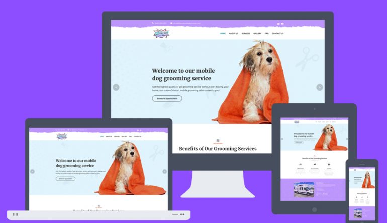
In 2015, mobile browsing overtook desktop browsing for the first time and since then it has only been growing.
According to statistics, 51% of users have said that they use their phones to discover new products and brands and up to 70% of web traffic happens on mobile phones.
It is undeniable that mobile browsing will continue to rise, and so it is important for websites to be able to work not only on mobile but also all devices that are smaller than a desktop. To accomplish this, web designers use responsive web design.
What is responsive web design?
Responsive web design is the practice of using HTML (Hypertext Markup Language) and CSS (Cascading Style Sheet) to make a website have a nice appearance and a good performance on all devices, such as phones, tablets, desktops, and game consoles.

How does responsive web design work?
To make a website able to be opened on devices smaller than a computer, there is a number of HTML and CSS elements that are used to change the layout of the website so it can accommodate every device.
Every layout consists of a number of images and text, and as such, both the images and the text must be able to change their size depending on the device the user is using to look at them.

Therefore, responsive web design consists of responsive images, responsive text, but also a meta viewport, which makes the web page be able to scale accordingly.
The meta viewport
To make a page work on all devices, it must contain a meta viewport.
So, what is a meta viewport?
A meta viewport is an HTML element that is used to adjust the size of a page to the size of the device. This element lets your browser know how to properly scale the page to fit your device.
All devices have a different meta viewport. For example, the meta viewport of a desktop is much larger than the one of smartphones.
A meta viewport contains the following:
- width of the device
- height of the device
- initial-scale, the default zoom level of the page
- minimum-scale, the minimum zoom level of the page
- maximum-scale, the maximum zoom level of the page
- user-scalable, the command which allows the user to zoom in on the page and which can be either yes or no
Responsive images
Responsive images are the ones that fit every device.
Using CSS, an image can become responsive and change its size accordingly to the size of the device it’s being opened on.
If the width is set to 100% and the height to auto, the image will scale both up and down. If max-width is set to 100%, the image will scale down but will never become larger than it originally was.
However, there are cases when this setting isn’t enough. Sometimes images, and especially large headers have to get cropped in order not to take up most of a smaller device screen.

There is also the issue of large images not being able to load fast on some devices… This is usually the case with large JPEG and PNG images. This can be solved by using compression and resizing said images. Also, JPEG images are much smaller in size than PNGs and therefore are used more.
Responsive text
Have you ever opened multiple browser windows on your monitor and tried to make them all fit, and noticed how the text on some websites followed the size of the window?
This is the result of responsive text, which is another feature of CSS and it can be set using the command vw, which stands for viewport width. This way, the font size will change and the text will move as you change the size of your browser window.
Additionally, CSS is also used to scale the font depending on the device that is opening the website, and this is done by using the command calc, which automatically adjusts the font size to the size of the screen.
Also, it is possible to give the font a setting of the number of the minimum and maximum pixels the font can be.
Don`t wait any longer, implement responsive web design now!
People are browsing using their small devices now more than ever and as such, it is important for websites to look good and perform well on all of those devices.
If you’re planning to make a website for your business, responsive web design is absolutely a must and we here at W3 specialize not only in creating beautiful websites but also in making them work on all devices. So give us a call or shoot us a message!


