Call-to-action buttons are used for guiding visitors and customers towards a certain goal. This goal is usually a purchase of a product or service, a reservation, a sign up for a free trial or newsletter, or a download of a free file.
Without them, your visitors and customers wouldn’t be able to complete any action you wanted them to, so having them and using them correctly is crucial.
But worry not, there are rules and tips to creating your own call-to-action buttons that you can easily implement and increase your number of conversions.
Let’s get started.
Characteristics of a good page design

There are multiple types of call-to-action buttons, such as add to cart buttons, download buttons, subscribe buttons, learn more buttons, and many others.
They vary in sizes, shapes, and content, and while they guide visitors towards certain conversion goals, they cannot do all the work by themselves.
There need to be other elements on the page that will contribute to the visitor deciding to click the call-to-action button.
So, before we get to the call-to-action button design, let’s first see what an effective page needs to have, so you can maximize the success of your call-to-action buttons.
1. A well-made headline
When someone opens your page, you want them to immediately know what that page is about. Don’t waste people’s time and more importantly, don’t confuse them. Both of these cases can (and most often do) make people leave, which increases the bounce rate of your website.
2. A good subheader
A good sub header is smaller than the header, in order to make it stand out more. Here’s where you can include additional information about your page. People often don’t even read these, and their main function is to make the headline pop, but this doesn’t mean that they’re unnecessary.
In fact, their function of guiding the visitor’s eye to the headline is actually quite important.
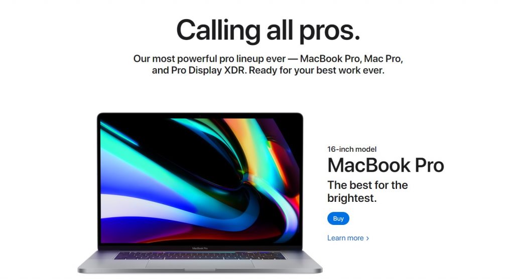
Here’s an example of both a great use of a headline and sub header.
The headline ‘Calling all pros’ is in bold letters, immediately letting you know that you’re viewing their ‘Pro’ products. The sub header provides additional information about the page, telling you exactly which ‘Pro’ products you’re about to see.
3. Benefits of the service/product
No matter if you’re selling a product or service, it is necessary that you include its benefits. Tell people how what you’re offering them will make their lives easier. This doesn’t mean that you need to write a whole essay; keep it short, and include the best features of the product/service.

Take a look at this BlackMilk page. The headline of the page, or the name of the dress, is on the top right side of the page since it is the most important part of the text.
Below it is a bold black call-to-action that lets you add it to your cart, and underneath is the most important characteristic of the dress: the fabric its made of, the length, the fact it has pockets and the lack of hem that enables the dress to flow beautifully. Short and informative.
4. A good image
Images are the main selling points. Even if you have a good description of all the benefits of the product, if the image you use for it is bad, it probably won’t convince people to press the call-to-action and buy it.

Warby Parker does this perfectly. The photos they use are high quality and show the product from different angles, and they also have a person model them. Every pair has 4 different photos for the best possible showcasing of the product.
Also, note the call-to-action design. Both buttons are blue, which helps them stand out from the rest of the page.
5. A testimonial or review
Testimonials and reviews are an important part of trust and brand building. They help convince your potential customers that your brand is to be trusted and that others have done business with you and enjoyed the collaboration or service.
Include a short review or testimonial that one of your clients wrote or even 3 that can rotate.
6. A good call-to-action
Last but not least, you need a good and effective call-to-action button. Make sure that it is visible and that it stands out from the rest of the page.
There’s a lot of thought behind call-to-action buttons, so just putting anything in a square and calling it a day won’t suffice.
The characteristics of a good and effective call-to-action design
Now that’s out of the way, we can look at what makes a good call-to-action design.
The possibilities are almost endless: call-to-action buttons can be different colors depending on the website’s color scheme, they can have different text depending on their role, and if they have the same role, the text can again be different, they can be different shapes, and they can even have a little animation to them (not to speak about different sizes!).
Because of all these different variations, there are consequently 8 characteristics of a good call-to-action design.
1. Call-to-action copy, or the text
A good call-to-action design doesn’t include just any text.

In most cases, the text is what makes people decide whether they want to click your button or not. And you have to admit, ‘click here’ is a pretty boring and overused button text, as well as ‘stay connected’ sounds much better than ‘subscribe’ or ‘receive email updates from our business’.
As previously mentioned, the text largely depends on the purpose of the button, so let’s look at a few examples of a more unique and better copy when it comes to call-to-action design and why they’re good.
Examples of good call-to-action design copy
- Claim your free trial – this copy includes the word ‘claim’, which is a strong word and makes for a more intense button. I think we can agree this is better than ‘free trial’ or ‘click here for your free trial’.
- Join us / Join now – It is part of human nature to want to belong and these make the visitor feel like they will become a part of something if they press them. They’re great if you’re looking for new hires or building a community.
- Continue – The goal of this call-to-action text is to be as simple as possible. Additionally, it makes the visitor think that the process they’re going through is short.
- Let’s talk – Use this instead of ‘ask a question’ to make your tone more conversational and your business more approachable.
- Sign up and get 50% off / Register and get a free coupon – We’ve spoken about newsletters and the benefits of email marketing in the past, so if you have a special offer for people who sign up for your newsletter, you can include it in your call-to-action button design, as it will help convince people to sign up.
- Explore more / Learn more now / See full article – You can use these instead of the old boring ‘read more’.
- Grab your free wallpaper / template – Use ‘grab’ instead of ‘download’ for a more casual and conversational tone.
- Discover x location / Plan your adventure / Fill my calendar – These copy examples are great for travel websites. Use them instead of the boring ‘click here to x’.
2. CTA button contrast
After you have found your ideal text, it is time for the design part.
Button contrast entails the button is a contrasting color from the background. If your background is white, a safe option would be to use your brand’s color for the logo. However, you can always use a different color, even a complimentary one if you want, just make sure that it fits the overall design of your site.
It’s true that the color red attracts the most attention and that green call-to-action buttons are effective, but in this case, one size doesn’t fit all.
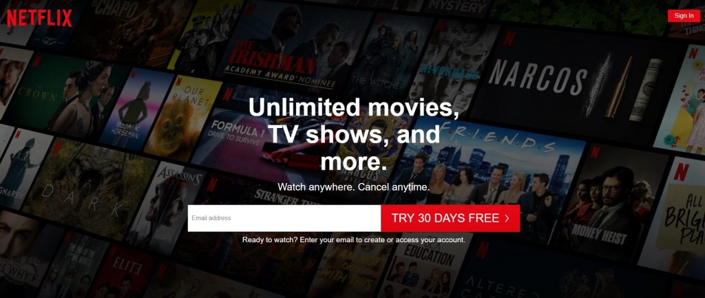
Note how in the Netflix example they used red for the call-to-action, but it fits their logo, so it makes sense. Experiment with colors and see what looks best. You can always ask your friends what they think of the design and if the call-to-action color attracted their attention.
Here’s a great color contrast example:

The call-to-action stands out from everything else on the page: the black text and the black and white images (and a single blue one). That shade of pink is stark and pretty unique, as well.
3. Call-to-action button clickability
You want to make your call-to-action button as clickable as possible and the way this is achieved is through a cool effect. You can make it look 3D or enable it to change color as people hover over it.
This call-to-action design element is especially important if you place two buttons next to one another. Make one of them stand out so people know which one they’re supposed to click first.

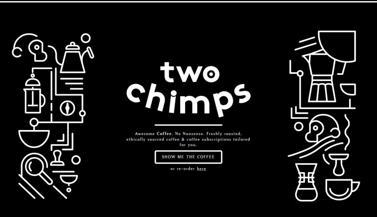
Here’s another example from the Two Chimps website.
If you hover over any of their buttons, they will do a little animation – they’ll turn white and the text will turn black. A small detail, but really useful because they show their visitors which button they’re hovering over.
4. CTA Size
This is a tricky one, because if you make your call-to-action button too big, it will look obnoxious, and if you make it too small, people might not even notice it.
Unfortunately, there isn’t a set rule for call-to-action button size, so you will have to experiment with different sizes and see what looks best (I highly recommend asking for opinions!).
Also, different sizes work for different websites, so you can always spend some time browsing the internet and see how other people have done it.
5. Directions that lead to the call-to-action button
You can use directional cues to make your call-to-action button stand out even more. Websites use arrows and subtle clues that lead the visitor’s eye to the call-to-action.
Here’s a brilliant example of this that I’ve used in the past:

Not only is the design beautiful and unique, but the ribbon guides the eye of the reader towards the call-to-action button as if saying: ‘hey, click this button right here’.
6. Information that indicates limited time offers
Limited time offers create a sense of urgency in the visitor and make them want to click the button more. Hence how a lot of the copy examples I provided earlier include the word ‘now’. You can also use the word ‘today’, as it is almost as urgent as ‘now’.
7. Additional information
This information is included either inside of the call-to-action button or below it and is in a smaller font. Its purpose is to provide additional info about the button and the offer it provides.
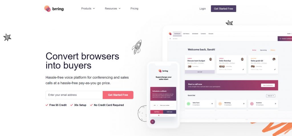
The information below the button reassures the visitor that their credit card information isn’t required, as well as provides useful information that is a free $5 card and a short setup of only 30 seconds.
8. CTA design – Whitespace
This is one of the most important call-to-action design elements on the list.
Whitespace, or negative space, is the empty space around elements and its purpose is to help them stand out. It is a huge part of modern web design and plays a significant role in it. Without it, minimalism wouldn’t be possible and we would all be looking at websites packed with all sorts of content.
Surround your button with whitespace to separate it from the rest of the page and direct the visitor’s attention to it.
9. Shape of call-to-action buttons
The call-to-action design usually involves rectangles, but in recent years, the button design has been getting more rounded edges. Combined with some subtle shading and shine, rounded call-to-action buttons can look really nice.
In a case study Unbounce did for a client, they changed the call-to-action shape from a boring rectangle to a rounded button and changed its color. The results showed that the green button did better and had 35.81% more conversions.

CTA button placement – Above and below the fold
Call to action buttons can be found everywhere: on the middle, the right and left side of pages, on the bottom and on top.
Websites do tests all the time where they put their button in different places, trying to find the most effective solution and maximize the number of their conversions.
Related: How to increase CTR for blog posts!
The terms above and below the fold find their origins in the early days of newspaper printing, when the newspaper would get folded in half when displayed. Naturally, the headlines that were on top of the page got the most attention.
1. Above the fold call-to-action design
In web design, the fold is the bottom of the browser, so all the content before it is above the fold.
The argument that above the fold lovers have is that the content that we see first is also the most memorable and has the most impact on us, so placing the call-to-action above the fold ensures that we see it almost immediately.
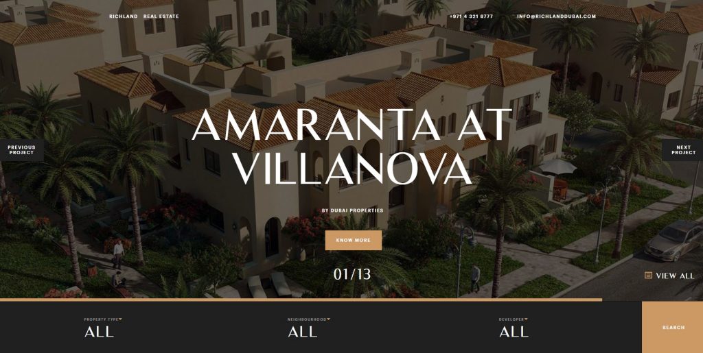
So, why would anyone place their call-to-action below the fold?
2. Below the fold call-to-action design
Above the fold call-to-action can be found more often on websites, but believe it or not, there are sites were below the fold call-to-action placement works excellently.
Websites that aim to showcase complex and useful products usually list all the benefits and properties of the product, and in the end, give you a call-to-action button.
The reason for this is that the company wants you to get a full understanding of what the product entails and how it can make your life easier, and in the end, after they’ve convinced you, they finally give you the option to purchase the product.
Here’s a great example of a website doing this:
Toggl and their below the fold button

For the people who have visited their website before, Toggl provides a call-to-action above the fold.
But for the people who are not familiar with their service, if you start scrolling down, you’ll get a list of all the benefits of the service first, and a call-to-action in the end, which enables you to purchase the product now that you know all there is about the service.
Websites also go for below the fold call-to-action buttons when they want to display a really good background photograph that first dazzles the visitor first.
Ultima Gstaad and their below the fold call-to-action
This luxury hotel with a boutique has a stunning website design, and more importantly for this article, they make use of the below the fold call-to-action. Let’s take a look:


Notice how there’s no call-to-action above the fold? You first get a good look of the hotel, and only after you scroll down, you can find the button. The call-to-action design is super simple and minimalist and stands out despite not being red and huge.
More examples of good call-to-action design
Here are some more examples of great pages and call-to-action design choices:
1. Fotonaut CTA example
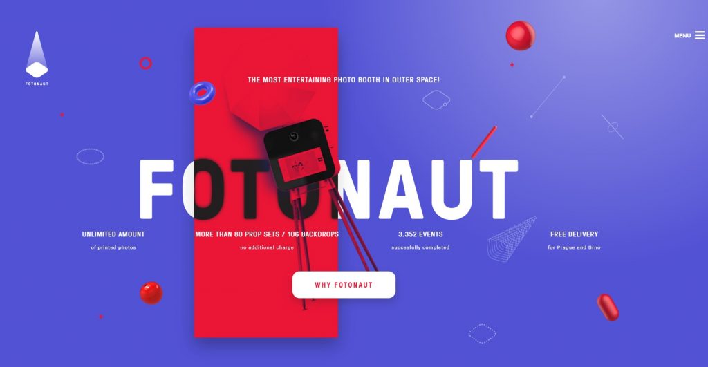
I personally love the brave choice of colors and their use. Instead of the background being white, and all the buttons and text being red and purple, they flipped the tables and created a really unique website.
The call-to-action is white, above the fold and in the center, and, if you hover over it, it does a little animation and changes its shape from round to rectangular.
2. Metaliquid call-to-action design

This is a pretty unique use of a call-to-action. The background of the website is a video, and if you click and hold the call-to-action button, it will add additional elements to the video. Pretty cool, right?
3. Allterrain

Instead of the classic call-to-action placement on the left side of the product, this clothing company decided to put it in the bottom middle of the page.
The left side of the page is reserved for the product images, the right side for its description and the middle for the call-to-action.
4. Red edition CTA

This furniture company placed their call-to-action on the bottom as well, but only on the right side instead of the middle.
This way, they placed their products in focus, letting the visitor get a good look at their gorgeous furniture and their properties before they decide to add it to cart.
Conclusion
There is a lot of science behind successful call-to-action buttons, but this doesn’t mean that it cannot be learned.
Good call-to-action buttons contain quality copy, or text, that will convince the visitor to press it, and a good contrast, so it can stand out from the rest of the content on the page.
There are also properties that make it look more clickable (like shadows and animations), as well as a good size and directions that lead the eye to the button.
Aside from these characteristics, there is also information that indicates limited time offers and additional information, as well as whitespace and the shape of the buttons.
They can be placed above or below the fold, depending on the website and what it’s about.
As call-to-action buttons greatly affect your website’s conversion rate, be careful who you’re hiring to make your website. If you’re interested, here’s an article we wrote on the scientific approach of building a website, and if you need someone to build a website for you, we’re a digital agency with over 100 projects in 2019.
Thank you for reading!

