We’re all familiar with how popular minimalism has been in web design in the past few years.
Negative space, simple navigations, clean fonts and removal of obsolete elements have been dominating in the web design world.
The elements considered obsolete and unnecessary include shadows and blurs and you’ll find many articles talking about how useless they are and how they don’t belong in minimalism.
But today, we’re going to look at how attractive and useful they can be when it comes to the aesthetics of a website.
Let’s start off with some examples.
Smart uses of shadows
1. Smallchat

Here’s the website of Smallchat, a chatting service. The second you enter their website, you can notice the minimalist look and subtle use of color.
White space dominates the website, and splashes of violet make it look more unique.
What adds to that uniqueness is the use of shadows, behind the graphic on the left and the call-to-action button. It’s so subtle that it doesn’t ruin the minimalist aesthetics and it also makes both the graphic and the CTA button pop.
2. Algolia
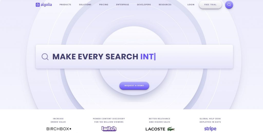
This is the homepage of Algolia. The background is very striking, yet soft at the same time and not at all heavy on the eyes.
They used subtle shadows behind both call-to-action buttons in the middle, but also the ‘free trial’ and search ones in the upper right-hand corner.
This is no coincidence: the shadows make the buttons stand out among the links and draw the visitor’s attention to them.
3. Scale
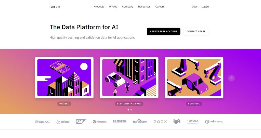
As opposed to the previous two examples, where the shadows were used to draw attention to call-to-action buttons, this website uses them for aesthetic purposes only.
The use of shadows is so subtle that you almost don’t notice it.
The background gradient paired up with the slight shadows behind the graphics creates a unique and stunning look.
Check out their website, the graphics and color combinations are done really well.
Why are shadows used in web design?
We’ve already mentioned two reasons why they’re used: they draw attention to certain elements by making them pop and help create a unique look.
Paired up with soft button edges and good opacity, they also make websites look more realistic.
The way shadows achieve this is through clever use of elevation. Elevation is defined as the relative distance between two surfaces on the z-axis.
The two surfaces in this case are the background and the buttons, so by making the buttons look like they’re floating above the background, shadows make them stand out from the background.
Elevation also helps create hierarchy, and make certain elements appear more important than others. Look at this example:

The bottom rectangle stands out more than the first one, making it look more important and telling us that we should be looking at it first.
Necessary uses of shadows
Drop shadows don’t have a use only when it comes to aesthetics; there are situations when they are necessary. Let’s look at a great example:

Here’s a screenshot of this document in Google Docs. When you want to use one of the options on top, a drop-down menu will appear, casting a subtle yet necessary shadow on the document.
It not only creates a distinction between the document and menu, but it also creates hierarchy, telling you that the menu is on top of the document, the most recent thing you opened.
Now that we’ve seen how useful shadows can be, it’s time to move onto the use of blur in web design.
How is blur used in web and mobile app design?
Blur may not seem as useful as drop shadows, but trust me, it can be. You may not notice it often, but that is exactly its purpose: it’s used to tone down certain elements so others would pop.
Blur was a huge web design trend back in 2015 and the fact it’s still heavily used today speaks volumes of its usefulness. Let’s look at how blur can be used.
1. Website backgrounds
The most common use of the blur effect in web design is the blurring of backgrounds.
At first thought, this may not make much sense because who would want to blur an entire background, especially if they spent hours trying to capture the right photo.
The reason web designers add the blur effect to backgrounds is so other elements, such as text and buttons, can stand out.
If your background image is detailed and there’s a lot of text, it can easily clash and distract the user from more important things, such as the call-to-action button.
Here are some great examples of websites with blurred backgrounds:

This business creates menus and their website is a great example of blurred background.
Warm yellow hues dominate the photo, and it’s blurred enough that you can recognize what is on it without it being distracting.
They used black and white for the elements, which with yellow makes a perfect combination.

Here’s another website with black and white. Like in the previous example, the background is blurred a perfect amount.
The shades of grey in the background don’t clash with the white font, in fact, they work together perfectly.
The white logo and navigation links are also able to stand out.

Here’s something a bit different. Compared to the previous two examples, this background image is more colorful, but not at all distracting.
The clever use of blur and the soft hues of the photo work quite well together and don’t take anything away from the title and description.
2. Blur effect in mobile apps
Made popular by Apple when they introduced iOS 8, the use of blur can be found everywhere when it comes to mobile apps.
If you’ve ever used an iPhone, you know what I’m talking about. If not, here’s what I’m referring to:
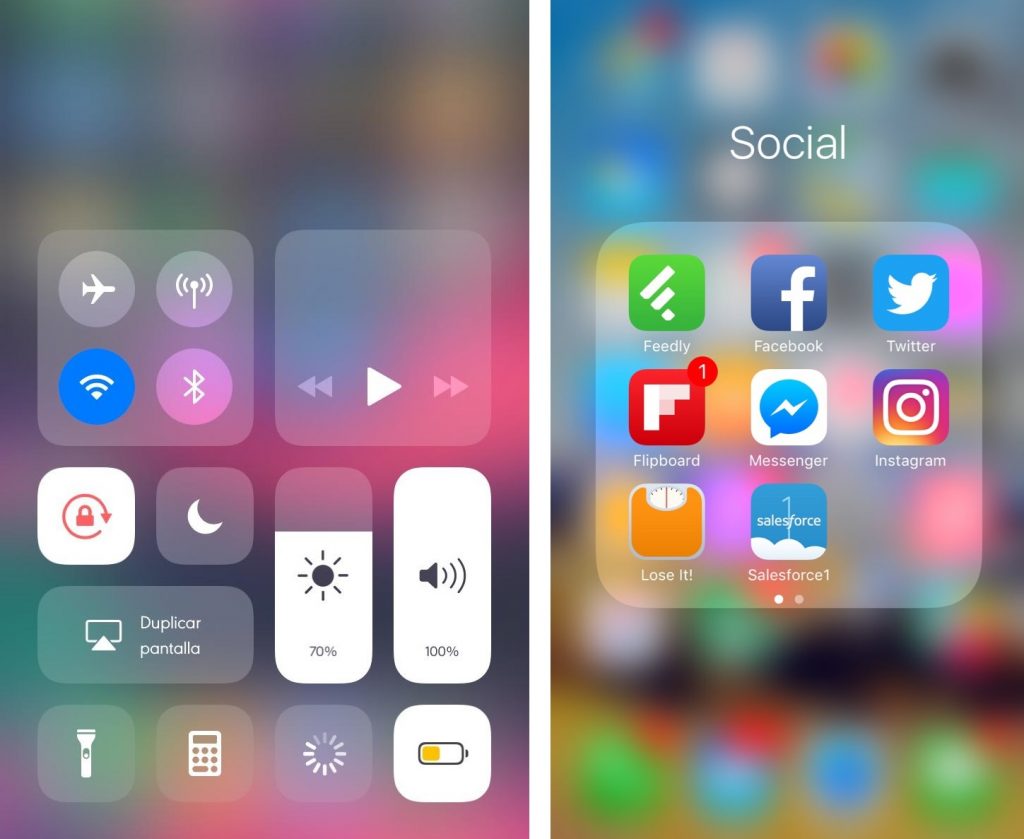
If you don’t have an iPhone, there’s plenty of customization apps that can make this effect possible.
The reason it became so popular is because it made it easier for people to navigate their menus.
It helped direct their attention to the right things and made the menu easier on the eyes.
Aside from the iOS and customization apps, other apps utilize the blur, as well.
3. Using blur for image loading
Website speed is one of the most important things about a webpage. If a website is slow, the user won’t have the patience to wait for it to load, resulting in them closing the website before even performing a single action.
One of the things that can significantly slow down a website are images. If not optimized, large and uncompressed images can make it impossible for someone to browse a webpage normally. The way this manifests is in the form of browser stuttering and it not responding.
To avoid this, you can use progressive image loading, which puts a blur effect over an image while it loads. So, when a user clicks on your website, the images won’t all load at once and make the page slow. Instead, they will load one by one as the user scrolls down, and they will go from blurred to clear.
Instances where the blur effect can cause problems
The blur effect is great, but only when used smartly and with restraint.
Blur is famous for not being very battery and CPU friendly, and, if used a lot, the user’s device battery can take a hit and their CPU can start heating up. If you’ve ever used an app that is more on the demanding side, makes your device struggle and drains your battery super fast, this is exactly what the blur tool can do if overly used.
If the blur is turned up way too much, it can cause readability problems. This is especially noticeable on blurred backgrounds that have a ton of elements over them. The blur can distract the user and prevent them from reading any important information on that page.
If you’re planning to use blur on your website background, make sure it’s not too intense. Because if it is, the user won’t be able to tell what your background even is, and it might also distract them from your call-to-action buttons and text.
Final word
Shadows and blur have their use still, even in minimalism. If used correctly and subtly, they won’t take away from the overall design. In fact, they contribute greatly to web design.
Drop shadows make elements such as graphics and call-to-action buttons more prominent and draw the eye of the visitor to them, but they also make websites look more realistic and detailed.
When it comes to blurring, it is mostly used for backgrounds, to make titles, descriptions, and elements stand out.
By blurring the backgrounds, web designers make sure that it doesn’t clash with the text and distract the user.
The blur effect has also found its use in mobile design and apps, and helps users navigate menus and increases legibility.
If you want your own website with beautiful shadows and smart blur uses, you can check out our web design services.
ARE YOU INTERESTED IN WEBSITE DESIGN? Check out this article about website design for private hospitals.
Thank you for reading!


