Everything around us, and especially technology, is changing at the speed of light. That’s why every year we have some brand new web design trends and 2023 is no different.
Although some web design trends have been around for years, you can’t rely solely on those trends to dominate your website if you want it to be at the top of your game.
You need to constantly follow the latest web design trends because that is the only way to have a fantastic website.
So, today we are going to present to you the crucial web design trends in 2023 and what they include.
Let’s dive into the most important ones!

Most interactive web design trends for 2023
The year 2023 is expected to bring a bevy of innovative designs that will take user engagement to the next level by utilizing unique solutions.
By deploying these new technologies in web design, customers and businesses alike can expect an incredibly interactive experience that works on multiple levels.
Navigation will become smoother for users who just want to browse as well as give a more customized approach for brands looking to drive conversions from their websites.
These are the latest and most important web design trends for 2023:
- 3D visuals
- AR & VR
- Minimalism
- Dark mode
- Micro-interactions
- Chatbots
- Soft colors
- Website load speed
- More social proof
- People-first content for SEO
In order to maintain a modern and stylish website that appeals to the audience, it is important to apply the latest web design trends, so let’s take a look at what each one involves.
1. 3D Visuals
High-quality 3D content is a significant web design trend in 2023.
These can be 3D animations or interactive content, and much more. Different 3D graphics and visuals will contribute to the attractive appearance of your website.

The possibilities are endless, and it’s up to you to be creative and fit 3D elements into your website as best as you can.
Moreover, 3D elements work especially well on minimalist layouts because then an ideal balance is created between simplicity and attractive appearance.
Related: What is graphic design?
2. AR & VR
Augmented reality (AR) and virtual reality (VR) will be more and more represented in all spheres of our lives.
AR uses a real-world setting where certain parts are added, so for example, you can see how a certain product would fit in your room.
On the other hand, VR is completely virtual and you are navigating a world like in video games.

You may think that both are very expensive and complicated to implement on a website, but this doesn’t have to be the case. If you want to offer multimedia experiences, then it is very profitable to invest in AR and VR.
In case you sell something, AR will pay off because more people will be willing to buy your product when they know how it fits in their room or how it looks on them, which is one of the biggest shortcomings of online shopping.
Although VR is currently in the spotlight with gamers and video gaming companies, it has applications in electronic commerce and all other spheres, so VR content can be very useful.
You will definitely stand out from the competition because VR is still not that common. Since it will surely be all around in a couple of years, take the opportunity to stay ahead of the pack.
3. Minimalism
Simple design, also called flat design, has been popular for years and we are sure that it will remain so in the foreseeable future.
For example, If everything is too colorful or if you use 5 different fonts, your website will look cluttered and cheap.
To achieve a minimalist look, use a maximum of three colors, use one font, and insert other fonts only if they fit perfectly.

You need to strike a balance by not using unnecessary elements and features just to make your website look as full as possible.
White space is a good thing so don’t be scared if white space takes up the majority of your website. It will make the things on the page pop up even more.
And that is why everything else on the website should be interesting and user-friendly. This way you will get a minimalist design and a very functional website at the same time.
In one of our blogs, we have given examples of the most creative websites and you will see that most of them are minimalist.
4. Dark mode
The dark mode is one of the web design trends in 2023 due to its multiple benefits.
Primarily because it reduces eye strain, which is certainly a big problem for most people today because they spend too much time looking at the screen.

In addition, dark mode gives a very modern look to the website and that is why many choose to implement it. It also allows you to easily highlight certain parts.
All low-light user interface options will be present in 2023 and beyond and that is why we advise you to implement dark mode.
But remember that it is not enough to just insert dark mode, you have to adjust the complete design to dark mode.
5. Micro-interactions
Micro-interactions have been an important aspect of web design for several years now, and they are likely to continue to be a significant trend in 2023.
These are small and subtle animations that occur on a website or application, often triggered by user actions such as a click or hover.

For example, the button changes color or size when the user hovers over it, or a notification appears when a user successfully submits a form.
Finally, these animations can help to reduce user frustration and improve the overall user experience.
Moreover, as technology continues to evolve and new web design tools become available, designers will have even more opportunities to create engaging micro-interactions that help to differentiate their websites and applications from the competition.
6. Chatbots
As it has been for several years now, one of the most popular web design trends in 2023 is definitely chatbots.
Chatbots are automated messaging tools that can simulate a conversation with a user, providing information, assistance, or answering questions.

In addition, they offer several benefits to website owners and users alike. Chatbots can:
- provide 24/7 support,
- reduce response times, and
- help to reduce the workload of customer support teams.
From a user perspective, chatbots offer a convenient and familiar way to interact with a website or business, as many people are already ordinary with messaging apps.
So, using chatbots make your website more responsive and interactive and returns results faster comparatively.
7. Soft website colors
By making use of pastel shades, subtle gradients, and warm palettes, web designers can give their designs an inviting and contemporary feel that appeals to a broad range of users.

Additionally, soft colors increase readability and create a better visual hierarchy by distinguishing text from surrounding elements.
As websites become more integral components of the online ecosystem in 2023, expect to see even more efforts toward utilizing soft website colors as one of the popular web design trends.
8. Website load speed
Website load speed will always be among the top web design trends, so it is in 2023 as well.
As internet speeds become more powerful, consumers will be expecting websites to meet their standards for quick loading times.

Companies that are aware of this trend and take steps towards optimizing their website loading speed can gain a competitive advantage over their rivals who do not prioritize optimization.
To minimize latency and maximize user experience, design choices that emphasize compression, caching techniques, and streamlined navigation elements should be made to make sure that browsing on your site is as enjoyable as possible.
9. More social proof
Building strong relationships is essential for success, and trust serves as the core foundation of any enduring bond.
By 2023, intelligent web designers will leverage social proof to foster user trust and build successful businesses.

In today’s digital age, having user reviews and customer feedback on websites not only adds social validation for customers but also enhances overall performance.
Additionally, utilizing strategically placed reviews within the customer experience promotes networking opportunities among customers who have purchased similar services or products.
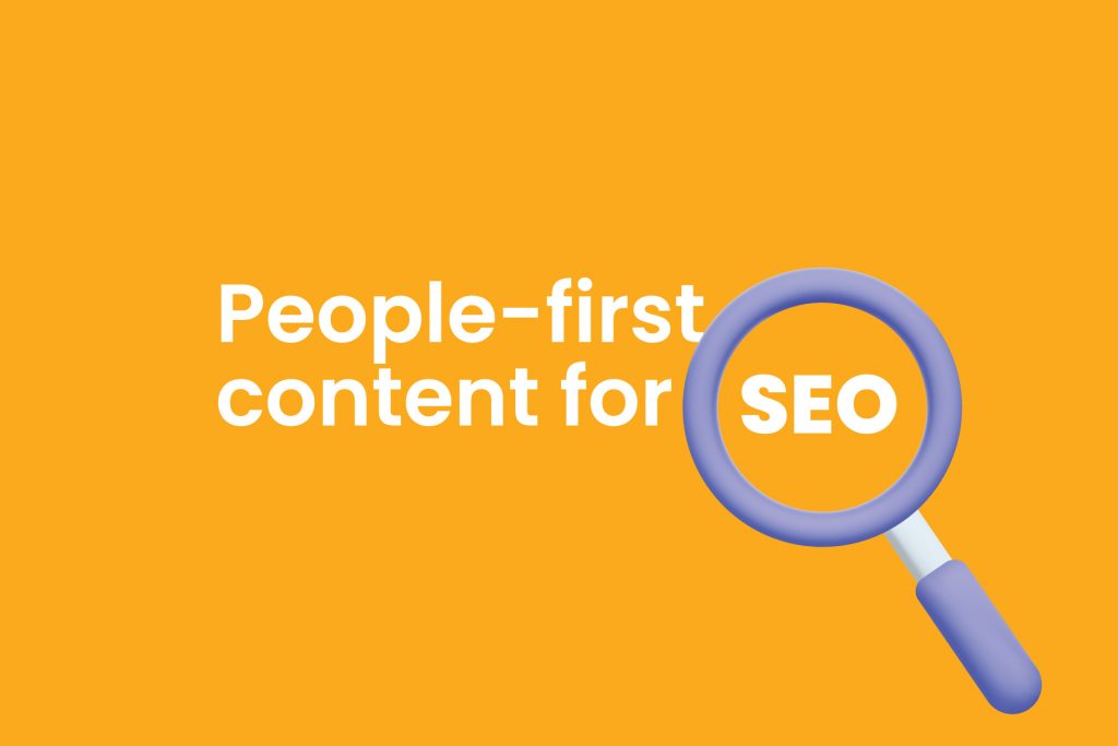
10. People-first content for SEO
Web design is rapidly evolving, and understanding the trends for 2023 is essential for businesses if they want to remain competitive. One emerging trend is people-first content for SEO.
Businesses, non-profits, or bloggers looking to maximize their website’s visibility can leverage the power of SEO.
By optimizing for search engines, websites gain better ranking on results pages, improving discoverability and expanding brand reach.
It is essential to know that Google unveiled an exciting guide on November 21, 2022, that encourages content creators to stay centered around people-first approaches.
This modernized algorithm emphasizes materials that are original and provides users with useful information they can trust while searching the web.
Conclusion
In this blog, you have learned about web design trends in 2023 which we consider to be the most popular and also the best for improving your website.
The world of web design is ever-evolving and website owners should stay abreast of the trends.
To maintain a modern and sleek website that appeals to audiences, it’s important to implement the latest UX designs, color palettes, and creative ideas.
Our advice is to not be afraid and try different trends because you can always remove them if you don’t end up liking them or if the numbers regarding your website are in decline.
The point is that taking advantage of these web design trends in 2023 can help propel your business into success for years to come!
Thank you for reading!