If you are in the process of redesigning your fast food restaurant website or creating a new one, you may be wondering how to make it stand out from the sea of other fast food websites.
The crucial thing is to evoke a certain feeling in visitors when they come to your site. In other words, your goal should be to create a website that makes people’s mouths water.
Good website design is essential in achieving this goal.
By following the crucial features that we will present, you can ensure that your fast food restaurant website design is effective in drawing in visitors and conveying a positive feeling.
Fast Food Restaurant Website Checklist (Must Have)
If you’re in the process of creating a website for your fast food restaurant, there are a few key things you’ll want to include in order to make it successful.
Probably you want to make sure that your site is visually appealing and easy to navigate.
After all, your mission is to make potential customers actually stick around long enough to learn about your fast food restaurant and what you have to offer!
By including the following essential elements, you can create a creative website that will help attract new customers and keep them coming back for more.
There are 5 crucial features fast food restaurant website must have:
- Homepage
- Menu
- About Us Section
- Reservations/Contact Form
- Location(s)
Homepage – First page of any website
Welcome to our fast food restaurant website!
A homepage for a fast food restaurant is the first page that appears when you visit their website.
It’s like the cover of a book – it should be eye-catching and make you want to learn more about the restaurant.
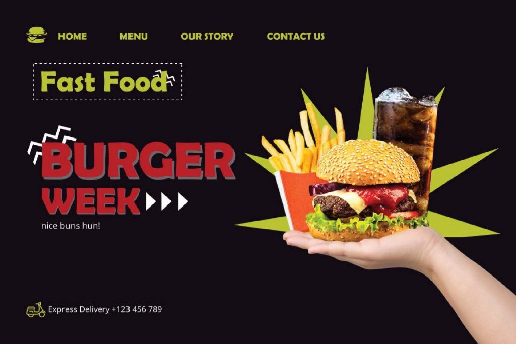
This page should also be easy to navigate, so users can quickly find what they’re looking for.
A good homepage will include links to the restaurant’s menu, locations, contact information, the about us section, and social media accounts. It may also feature special deals or promotions.
By providing all of this information upfront, fast food restaurant websites can give users a great first impression that will encourage them to come back again and again.
Here is an example of great content on the Homepage.
Menu – Everything you have to offer
If you’re running a fast food restaurant, one of the most important things to include on your website is a menu.
After all, people aren’t going to visit your restaurant if they don’t know what you’re serving.
Fast food restaurant websites are known for their ability to showcase an extensive menu of delicious items.
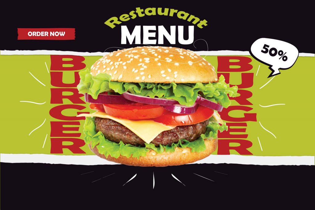
From burgers and fries to shakes and desserts, there’s something for everyone to enjoy. And of course, don’t forget about the drinks.
So make sure to list all of your delicious offerings in an easily accessible spot on your site.
And don’t forget to include pictures – we all know that food looks better and more catchy when it’s photographed!
About Us section – Funny story about your fast food restaurant
If you’re like most fast food restaurant websites, the “About Us” section is probably pretty boring.
It’s full of stuff like “we’re a fast-casual restaurant that specializes in healthy, affordable food” and “we’re committed to providing great customer service.” Yawn.
But it doesn’t have to be that way!
The “About Us” section is a great opportunity to show off your restaurant’s personality and history. So why not have some fun with it?
For example, you could start by telling the story of how your restaurant was founded.
Was it by a group of friends who shared a passion for good food? Or was it by a former fast food executive who saw the error of his ways?

Either way, it’s a great way to introduce your concept and get people interested in your business.
You could also use this section to share some of your restaurant’s core values. Are you all about fresh, healthy food? Or do you pride yourself on being the most family-friendly restaurant in town?
Whatever it is that makes your restaurant unique, make sure to highlight it in the “About Us” section.
So go ahead and have some fun with your fast food restaurant website’s “About Us” section. It’s a great opportunity to show off what makes your business special.
Reservations / Contact form – Make it easier for users to get in touch with you
A fast food restaurant website would not be complete without a Contact form or Reservation button prominently displayed on the homepage or navigation bar.
After all, what’s the point of having a website if potential customers can’t easily find your contact details or make a reservation?
Including these features on your website makes it easy for customers to get in touch with you or make a reservation, and it helps to create a more user-friendly experience overall.
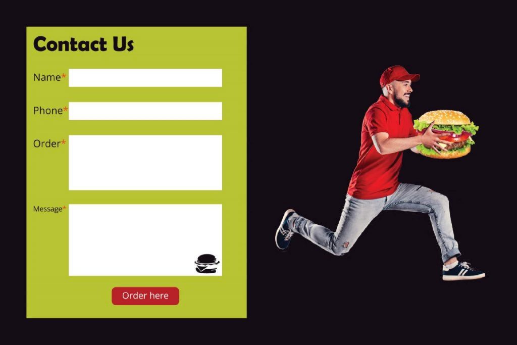
For example, some fast food restaurant websites make their contact details or reservation field less visible, resulting in potential clients having to search for the information they need.
This can be frustrating for customers, and it may even cause them to give up on trying to contact the restaurant or make a reservation.
So, to avoid this, make sure that your contact form or reservation button is clearly visible on your website.
This will make it easy for customers to get the information they need, and it will help to ensure that they have a positive experience with your business.
Location(s) – Show users where you are
It’s important to include a location on your fast food restaurant website so people can find you more easily and know exactly where you are.
After all, if they can’t find you, they can’t eat your delicious food!
Of course, if your restaurant has multiple locations, list them all.
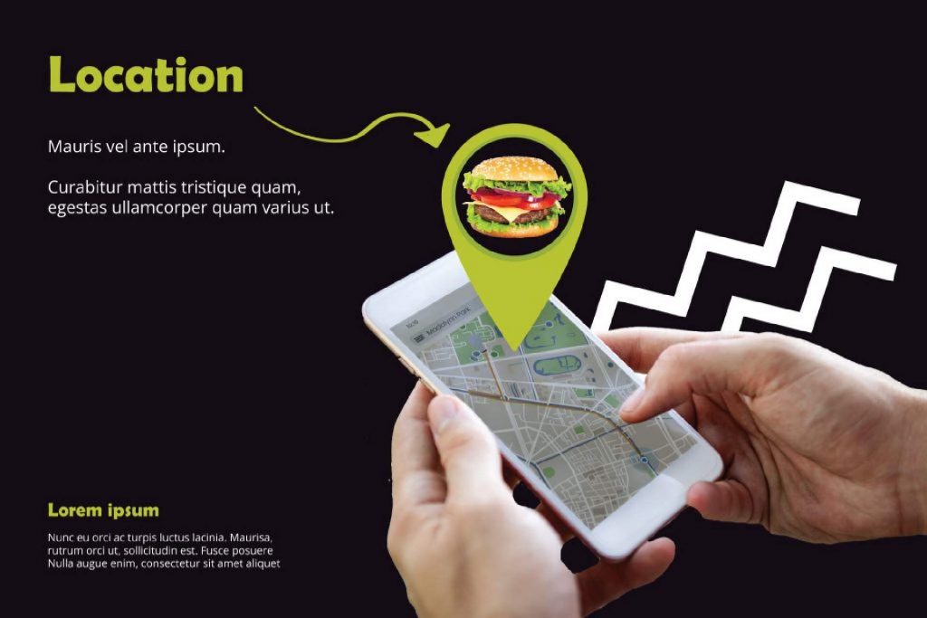
Plus, including a map on your website is a great way to show off your local knowledge and help people orient themselves.
So make sure to add a location on your fast food restaurant website – it’s good for business and good for customers!
7 tips for improving your fast food website
If you’re looking for ways to improve your website, you’ve come to the right place. Here are 7 brilliant tips that will help you get the most out of your fast food restaurant website:
- Integrate Social Media Accounts
- Improve SEO
- Include Customer Reviews
- Build a Trust
- Optimize Online Ordering
- Offer Discount Coupons
- Optimize Website Layout
1. Integrate Social Media Accounts
If you’re running a fast food restaurant, then you know that social media is essential for promoting your meals and generating buzz.
After all, what’s the point of cooking up a delicious burger if nobody knows about it? That’s why it’s so important to include social media icons on your website.

Facebook, Instagram, and Twitter are all perfect platforms for showing off your delicious food.
By doing so, you’ll make it easy for people to find your restaurant online and share your meals with their friends.
And let’s be honest, we all know that word-of-mouth is the best way to generate new business.
So don’t neglect those social media icons – they could be the key to success for your fast food restaurant!
2. Improve SEO (Search Engine Optimization)
When it comes to SEO, fast food restaurant websites are in a unique position.
Not only do they have to compete with other restaurants for ranking on search engines, but they also have to contend with the fact that people are generally searching for fast food when they’re already in a hurry.
As a result, fast food restaurants need to ensure that their websites are optimized for both speed and SEO.

Fortunately, there are a few simple steps that any fast food restaurant can take to improve its website’s SEO:
- Firstly, they should focus on creating keyword-rich content that accurately reflects the products and services that they offer.
- Secondly, they should make sure that their website is easy to navigate and mobile-friendly.
- Finally, they should ensure that their website is regularly updated with fresh SEO content.
By taking these steps, fast food restaurants can significantly improve their chances of being found online by hungry customers.
3. Include Customer reviews
As they say, there’s no better advertisement than a satisfied customer.
So, if you’re looking to add some social proof to your fast food restaurant website, including a page of customer reviews is a great way to do it.
Not only will this showcase what customers think of your food and service, but it will also give potential customers an insight into what they can expect from your restaurant.

Of course, including a page of customer reviews also has its downside – namely, the risk of negative reviews.
But, as they say, any publicity is good publicity. So, even if you do get the occasional bad review, just remember that it’s all part of the game.
For example, McDonald’s customer reviews are always funny. They range from “I got food poisoning from your restaurant” to “Your fries are the best thing ever.” But one thing is for sure, people love to read them.
4. Build a Trust
If you really want to build trust with your customers, you have to go above and beyond with your web design.
A clean, professional website sends the message that you’re a reliable and trustworthy business.
Moreover, including customer reviews and testimonials on your website can help to build confidence in your products or services.

Finally, high-quality content shows that you’re an expert in your field and that you’re dedicated to providing value to your customers.
By taking the time to create a well-designed website, you can send a strong signal to potential customers that they can trust you.
5. Optimize Online Ordering
In today’s fast-paced world, time is of the essence. That’s why fast food restaurants need to make sure their websites are optimized for online ordering and delivery.
Customers should be able to find what they’re looking for quickly and easily, and there should be clear links to the ordering and delivery options.

A good UX design will ensure that the customer’s experience of using your website is smooth and easy, while a good UI design will make sure that the customer interface is intuitive and user-friendly.
Otherwise, they’ll just go to a competitor’s website that is easier to navigate.
So, if you’re running a fast food restaurant, take a look at your website and make sure it’s up to snuff.
6. Special offers and loyalty program
As an incentive to visit your site, you could also include special offers and loyalty programs.
For example, you could offer discounts for customers who sign up for your loyalty program, or special deals for those who order during happy hours.
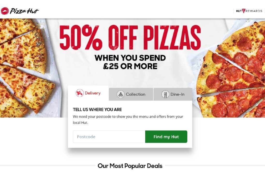
By offering such perks, you can encourage customers to visit your site more often, boosting your business in the process.
So if you’re looking to drive more traffic to your fast food restaurant website, be sure to include some amazing deals and discounts.
7. Optimize Website Layout
There are some tips for better optimizing your fast food restaurant website layout:
- The color scheme should be warm and inviting, not cold and sterile.
- Avoid using too many images or videos; instead, focus on clean lines and efficient navigation.
- Make sure the overall tone of the website is friendly and welcoming.
- Highlight your unique selling points on the homepage.
- Make it easy for visitors to find contact information and directions.
By taking the time to optimize your website layout, you can ensure that your visitors have a positive experience and are more likely to come back in the future.
List of Top 10 Fast Food Restaurant Websites for 2022
Looking for the best fast food restaurant websites? Here are the top 10 fast food restaurant websites for 2022:
These websites are fast, efficient, and easy to use – especially when you’re trying to decide what to eat for dinner.
You can browse the menus of your favorite fast food restaurants, compare prices, and even order online and have your food delivered. Plus, they’re user-friendly and packed with information.
So whether you’re looking for a new restaurant to try or just trying to find the best deal on your favorite food, these websites have everything you’re looking for.
Conclusion
A website is the first thing that people see when they want information on your business, so it’s important to make sure everything about you and what makes up part of “your brand” comes across well in this space.
Your fast food restaurant website must be easy to navigate because “The customer is always lazy”.
The minimalist approach and carefully done UX and UI design are the best choices for providing the ultimate experience to the visitors of your fast food restaurant website.
Staying on top of all these elements can sometimes be a tiring task.
Finally, if you need professional support in the process of building the ultimate fast food restaurant website, feel free to contact us.
Thanks for reading!

